EOS Bodies New
Rumors about EOS, Cinema EOS & Mirrorless Bodies.
- Threads
- 5.8K
- Messages
- 260.5K
Lenses New
Rumors about EF, EF-S, CINE & Mirrorless Lenses
- Threads
- 2.6K
- Messages
- 85.3K
PowerShot Cameras New
Rumors about the little Canons
- Threads
- 240
- Messages
- 3.5K
Speedlites, Printers, Accessories New
Everything else Canon related, including Speedlites, Printers and Accessories
- Threads
- 584
- Messages
- 8.2K
Third Party Manufacturers New
Rumors about third party manufacturers, including Sigma, Tamron, Tokina, Zeiss, Nikon, Leica and the rest
- Threads
- 1.1K
- Messages
- 26K
EOS R New
Canon EOS R camera discussion
- Threads
- 966
- Messages
- 23.9K
EOS DSLR
Topics related to EOS DSLRs
- Threads
- 4.3K
- Messages
- 89.8K
EOS M
All Canon EOS M and EF-M lens discussion
- Threads
- 564
- Messages
- 10.3K
Lenses New
All lenses, including EF, EF-S, CINE
- Threads
- 3.9K
- Messages
- 75.7K
PowerShot New
All PowerShot topics, including the G1 X.
- Threads
- 237
- Messages
- 4.1K
Third Party Manufacturers New
Nikon, Leica, Sigma, Tamron, Tokina and the rest go here.
- Threads
- 1.2K
- Messages
- 18.8K
Software & Accessories New
Accessories and software for photography and filmmaking.
- Threads
- 2.9K
- Messages
- 38.6K
Reviews
Discussion Threads for Canon Rumors Reviews
- Threads
- 676
- Messages
- 15.6K
Lighting
Including Speedlites & other third party manufacturers
- Threads
- 734
- Messages
- 8.1K
Patents New
All Canon and third party related patents.
- Threads
- 313
- Messages
- 9.4K
Firmware New
All Canon firmware updates will be posted here, you can also start firmware discussions here
- Threads
- 71
- Messages
- 2.6K
Canon General New
General information or talk about Canon Inc.
- Threads
- 1.8K
- Messages
- 37.5K
Industry News New
Industry news that doesn't pertain to Canon
- Threads
- 897
- Messages
- 16.7K
Technical Support New
Post any tech support questions here.
- Threads
- 1K
- Messages
- 10.1K
Deals on Gear New
The latest deals on Canon and other photography gear.
- Threads
- 2.9K
- Messages
- 15.7K
Cinema EOS Rumors
Rumors about Cinema EOS cameras and lenses.
- Threads
- 135
- Messages
- 4.1K
Cinema EOS News New
Current news for Cinema EOS products and productions.
- Threads
- 140
- Messages
- 2.1K
Cinema Accessories
Talk about the various accessories for cinema & videography production.
- Threads
- 17
- Messages
- 77
Cinema Industry News
News from the cinema & videography industry.
- Threads
- 24
- Messages
- 73
Questions and Answers New
Ask all of your photography related questions here
- Threads
- 154
- Messages
- 1.3K
Photography Technique New
Share and learn different techniques pertaining to photography such as composition, lighting, use of specific accessories and anything else that comes to mine.
- Threads
- 657
- Messages
- 11.6K
Post Processing
A area to discuss post processing techniques and software used.
- Threads
- 244
- Messages
- 2.9K
Videography Technique
A place to discuss video technique with Canon Cinema EOS, EOS DSLR's or any other movie making product. Discuss workflow here as well.
- Threads
- 61
- Messages
- 454
Business of Photography/Videography
Discuss anything related to the business of photography or videography.
- Threads
- 185
- Messages
- 3.1K
Video & Movie
Post your videos made with Canon gear here.
- Threads
- 390
- Messages
- 2.2K
Camera Body Gallery
Images from the 1D X, 5D Series, 6D, 7D Mark II, 70D, G1X MK II, and G7X, and other Cameras
- Threads
- 61
- Messages
- 2.4K
Lens Gallery
A board to show examples from various lenses. Please post your lens images in the appropriate thread.
- Threads
- 226
- Messages
- 10.4K
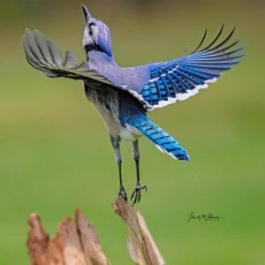
Animal Kingdom New
Post all your animal shots here.
- Threads
- 505
- Messages
- 51.9K
HDR - High Dynamic Range
For your HDR or Tone Mapped Images.
- Threads
- 24
- Messages
- 1.2K
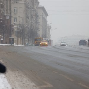
Street & City New
Post your street and city landscape images here.
- Threads
- 330
- Messages
- 2.8K
Sports
Post all your sports images here.
- Threads
- 254
- Messages
- 6K
Theater, Concert and Event
Post your Images taken at Theater, Concerts and Similar Events
- Threads
- 23
- Messages
- 294
Travel
A place for your images taken while exploring the globe.
- Threads
- 66
- Messages
- 667
Wedding Photography
Post Wedding Photos, and discuss the technical aspects of Wedding Photography. The business part is covered in the "Business of Photography section
- Threads
- 34
- Messages
- 376
Underwater
Photographs taken underwater.
- Threads
- 17
- Messages
- 176
Site Information
All suggestions & information about canonrumors.com
- Threads
- 350
- Messages
- 5.3K
Forum statistics


Gallery statistics
- Categories
- 1
- Albums
- 24
- Uploaded media
- 194
- Embedded media
- 1
- Comments
- 25
- Disk usage
- 462.4 MB