Color Management Can Be Easy
You are likely familiar with color management if you’ve spent time behind a camera or if you have invested a fair bit of your time in photography and videography. We often unconsciously perceive the absence of color management in everyday life. For example, we have all taken pictures, ordered prints and suddenly realized that they have a flaw, like a green cast. “That’s not what it looked like when I took the picture!” is the most common reaction. Nobody wants skin tones that remind them of zombies; certainly not in a professional environment, such as portrait and wedding photography. The process might seem daunting, but color management can be easy.
©Jochen Kohl
How does the color discrepancy between perception and prints arise?
To understand color management, you first need to take a closer look at the properties of light. White light consists of all of the colors of the visible spectrum. As the composition of colors changes, the color temperature changes. For instance, there are more red component parts in the evening sun than in the midday sun, where the colors have a much more balanced ratio. That means a white sheet of paper should have a reddish or neutral look at times, but that is not always the case.
What about people? The retina of the eye, which is quite comparable with the sensor of a camera, perceives these color differences and redirects these signals to the brain. The brain analyzes this data and completes a white balance based on previous sensory experience. As a result, the sheet of paper mentioned above would then appear white. This phenomenon is called color constancy.
People also perceive colors at different brightness. Our brains perceive an image that isn’t what exists in purely physical terms. This explains the green-tinged photo: it was probably taken in fluorescent light, and technical devices do not have the “brain power” to counteract this phenomenon.
Color management will solve this issue
To a certain extent, color management attempts to simulate the brain and corrects the raw data coming from the sensor in order to match the feeling of human perception more closely. Color management can do even more than just that. While a human being represents a closed system (more or less), where everything is finely tuned, this is not the case with modern technology. We combine input devices (camera, smartphone, etc.) and output devices (monitors, printers, etc.), without considering that each device has a wide range of capabilities to capture or play back colors. Different papers also have their own reflection properties when they’re printed. All devices must be compatible with each other to prevent any unpleasant surprises. This is why color management is necessary to achieve color consistency across devices and outputs.
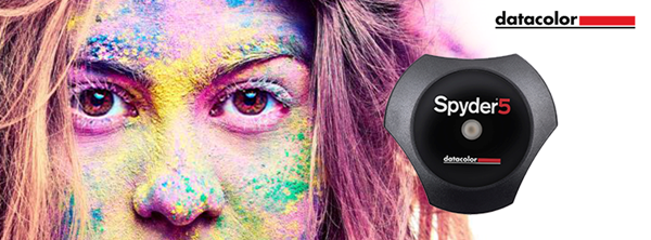
The free Datacolor Spyder5 eBook – Color Management Can Be Easy provides compact and practice-oriented information to answer the question, “What do I have to keep in mind to smoothly coordinate all the equipment in my workflow?”
Sign-up for your free eBook now!
Full eBook Includes:
Chapter 1: The fundamentals of Color Management
• Which color measuring instruments you need for color management
• How the digital color world ticks
• Why you should work with RAW data
Chapter 2: Camera calibration – the first step in your color workflow
• Which tools are available for calibration
• How to obtain evenly-balanced contrast with the SpyderCUBE
• SpyderCHECKR and how it provides color balance
• How to get razor sharp autofocus using SpyderLENSCAL
Chapter 3: Monitor calibration – the window into your image file
• How to initially calibrate your monitor
• What the colorimeter does for you during calibration
• How to control the ambient light
• The options a soft proofing tool can offer you
Chapter 4: Monitor/Projector calibration – advanced settings
• How to make extended calibration settings
• What an advanced analysis entails
• The way to calibrate two monitors
• What you must pay attention to while calibrating a complete studio and a projector
Chapter 5: Printer profiling for accurate prints
• What you need to know about printer profiles
• How to check if your printer and the printer driver are working properly
• What to observe when working with a spectrocolorimeter
• Get insights on how to use printer profiling technology
Chapter 6: Softproofing and printing – using a service provider
• How to proof your images on the monitor
• Printing your photos by yourself
• What you need to know about monitor proofing during photo printing from a service provider
• What you should consider when printing on paper, canvas and foil
(2018). Foreword, Color Management Can Be Easy (pp. I–II).


