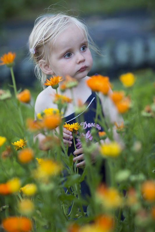
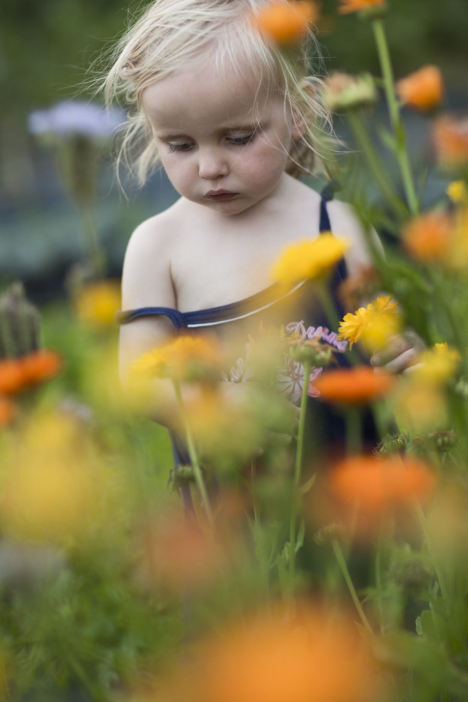
Taken around sunset. 5D3 with 85 1.2L II, 1/160, f/2.0, ISO800, natural light.
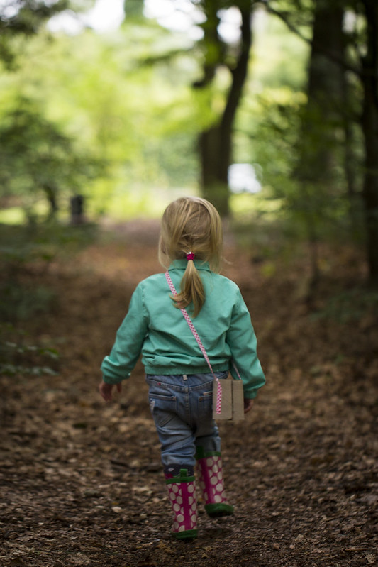
JonAustin said:Beautiful little girl, Vossie. Love the image of her walking away in those boots!
")
JonAustin said:Beautiful little girl, Vossie. Love the image of her walking away in those boots!
Priceless!Vossie said:Taken around sunset. 5D3 with 85 1.2L II, 1/160, f/2.0, ISO800, natural light.
jdramirez said:I expected it to be warmer... It has a blue tone... my phone maybe?
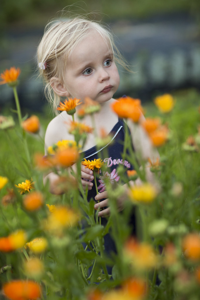
Vossie said:In the below edit, I increased the color temp from ~7700K to ~12000K and reduced the saturation of the red, yellow and orange by ~20. Do you think this is better?
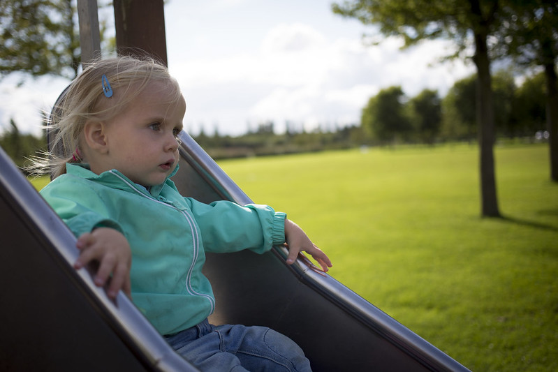
I feel they lack a bit of a punch.