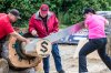
I think this one might be kind of regional....
You are using an out of date browser. It may not display this or other websites correctly.
You should upgrade or use an alternative browser.
You should upgrade or use an alternative browser.
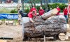
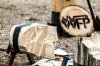
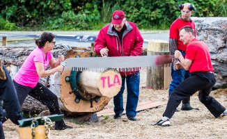
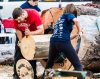
Loggersports!
- Thread starter Logan
- Start date

Upvote
0
Good shots! I'll watch it on Youtube etc., and I appreciate the exercise of skill and practice it takes.
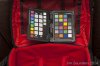
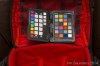
How do you feel about the reds in these photos? I ask because I have found with my Colorchecker Passport that my camera has trouble with blues sometimes, and I suspect (but haven't confirmed) that reds sometimes show up too brightly also.
Jim
How do you feel about the reds in these photos? I ask because I have found with my Colorchecker Passport that my camera has trouble with blues sometimes, and I suspect (but haven't confirmed) that reds sometimes show up too brightly also.
Jim
Upvote
0
i feel that my camera struggles with reds (t3). a frame-filling red flower is worst case. they seem to come out really saturated with less than ideal gradation? Blues i feel are a stong point. part of the problem may be that i do not fully understand the relationship between vibrance and saturation in lightroom. I feel like vibrance is how colourful things are, and saturation is how much colour is in the colourful things, if that makes sense. some of these pictures i turned the vibrance up to combat the grey overcast, and the saturation down a tiny bit to combat the red getting messed up. i usually leave saturation alone because it screws up blue skies very quickly, and use vibrance to get richer colours instead.
tldr: camera struggles with red, but it could be my hamfisted post processing as well.
tldr: camera struggles with red, but it could be my hamfisted post processing as well.
Upvote
0
i have scrapped entire sets of photos of red flowers because they are unsalvageable. its almost like theres is no depth to the reds once they become saturated, and lowering the saturation (of everything or just red) does nothing to bring back range of colour/tone. its like trying to salvage blown highlights in a blue sky, but it happens at the maximum red value not the maximum light value.
also my screen is only calibrated by eye not by any kind of science.
also my screen is only calibrated by eye not by any kind of science.
Upvote
0
Logan said:i feel that my camera struggles with reds (t3). a frame-filling red flower is worst case. they seem to come out really saturated with less than ideal gradation? Blues i feel are a stong point. part of the problem may be that i do not fully understand the relationship between vibrance and saturation in lightroom. I feel like vibrance is how colourful things are, and saturation is how much colour is in the colourful things, if that makes sense. some of these pictures i turned the vibrance up to combat the grey overcast, and the saturation down a tiny bit to combat the red getting messed up. i usually leave saturation alone because it screws up blue skies very quickly, and use vibrance to get richer colours instead.
tldr: camera struggles with red, but it could be my hamfisted post processing as well.
In LR there is the HSL tab on the right, you can adjust those parameters for discrete bands of colours and I found that helped when I shot some photos of a guy in a red shirt which came off the card looking like the man on the right in the last photo. Anyway I'll give that passport a go with a vivid red subject tomorrow and put up some results.
Jim
Upvote
0
Similar threads
- Replies
- 10
- Views
- 617
- Replies
- 0
- Views
- 789
- Replies
- 2
- Views
- 1K
- Replies
- 4
- Views
- 1K