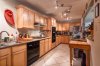
Need some help, lighting on this kitchen real estate type shot....

cayenne

CR Pro
Mar 28, 2012
2,866
795
Hi all,

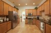
I've been trying my hand at learning how to shoot some real estate type shots. I started with my kitchen which poses some challenges, especially for a first timer.

It is long and somewhat narrow.

I shot this with my new canon 11-24 lens.

I took a normal exposure as a base image, and my lights in this kitchen, ALL of them the ambient ones are 2700K, I know this as that I bought all the same bulbs as that I do a cooking video here, CWI: Cooking While Intoxicated you youtube and know how important it is to not have mixed lighting on video. HARD to correct there.

Anyway...I was trying the technique where you take multiple shots, and use a flash in them to highlight things, to mask in with photoshop.

Many of my flash were too bright...I'm still getting used to it. But I did try to get the color close..and put a full CTO on the 600EX-RT flash I handheld. I've done a DIY cam ranger thing with an android tablet, DSLRRanger and a TP-LINK TP-MR3040 unit I flashed the firmware on.

So, I have the equipment, and I'm getting decent with PS...but I'm still missing a lot here.

I'm posting the before and after of what I've tried so far. But I'm at a loss, on where to set my flashes to try to get rid of some of the horrible shadows...and I'm not sure..what shadows do you want to keep and which to try to eliminate? Do you get rid of the floor ones under the cabinets...shadows off the tile floor? Do I need to brighten the upper part of the wall above the cabinets? I tried to use the flash in places up there, but it just didn't come out and I couldn't figure how to get it to be smooth looking, everything I tried to put in up there looked blotchy..even with soft brushes and molasses slow flow on the brush....

Another problem area..the shadowed area behind the stovetop burners to the left of the oven...I tried flash aimed at that, but it just blew out and was too hot spot from the flash. Do I need to have an umbrella on the hand held flash to help with this?

Anyway, I'm really wanting to learn, but whiles there YouTube videos aplenty with lightly touching this subject, and most just the photoshop side of things, there's little I can find on how they actually use the flashes to augment the scene, especially on the interior....and difficult rooms and how to get the mixed light to match up...etc. And how low do you set the flashes, etc? I think I had 1/8 power and it was blowing things out, but when I did like 1/16th power...it didn't seem to make much a difference at all...

So, if ya'll could comment./critique, and maybe even copy the images and notate where to do things and where a flash might go, etc...I'd VERY much appreciate the education.

If you know good links or books on this, I'd really like to know....

Thanks in advance!!

cayenne
 

Attachments

  • base_image_test_kitchen_2_084.jpg
    3.1 MB · Views: 226
  • edited_test_kitchen_2_084.jpg
    3.1 MB · Views: 224
Jan 29, 2011
10,673
6,120
Hi cayenne,

I have few observations and hope you take them in the helpful manner they are sent ;)

If the intent is a real estate style advert that is one thing, if you are trying to illustrate a chef's kitchen that is another, these comments are assuming the former.

First would be staging, you need to remove all the clutter, this will transform the look of the image, get rid of practically everything on a counter, maybe put just one or two signature items back on them to give scale and interest. Remove the stuff under the table right/chopping board while you're at it.

As for your base image, you have a lot of DR in the scene with direct lights and very deep shadows. I am sure that is not how it looks to the eye, so I'd bracket 5 shots 1.3 stops apart then load them into LR-Photo-Photomerge-HDR then play with the 32 bit file to mitigate those dark areas. That would be my base shot.

For the floor I'd flash into the ceiling to get one even exposure like the far end of your image across the whole floor, I'd let the shadow fall entirely under the table image right. The floor would be one or two images by itself.

The shadows above the cabinet would probably be reduced enough via the base shot 32 bit method, but if not it just takes a bit of messing around to get a shot or two that will illuminate the ceiling without such strong shadows. I sometimes use a small white umbrella to make the 600 more diffuse.

The 'blue' light from outside is very distracting, you need to either gel it or adjust it in post.

But you did an awful lot right! The height and angle look great given the dimensions, I'd maybe look at it through the opening where the flower pot is but suspect you got the 'right' spot. The verticals are close to perfect. Your technique is sound, the extra flash exposures are working though a little overwhelmed in such a compact space. With regards those extra flash shots, think of where the lights are pointing and the 'key' aspects of your space, the chopping board, the gas rings, etc. They are the things that can get a little lift to help tell the story of your space.

So here is my rework of your two files and one of mine with similar colored cabinets and floor. Notice the lack of shadows on the floor and ceiling, the sparsity of extraneous elements (this was professionally staged by a designer not me) and the way I used the brightness of the next space to make the kitchen space an element within a home rather than a mugshot. The basis of my shot is two images, right side and left side, with an Einstein into an umbrella moved across the room to get the comparative evenness.

Hope this helps.
 

Attachments

  • 1.jpg
    1.jpg
    692.7 KB · Views: 224
  • 2.jpg
    2.jpg
    443.1 KB · Views: 191
Upvote 0

cayenne

CR Pro
Mar 28, 2012
2,866
795
THANK YOU!!

This is exactly the type of critique and info I was looking for.

I did actually take a number of bracketed exposures and played a bit with trying some HDR on them, but I was hoping to try to shoot like I'd seem some others that didn't use HDR and got a more magazine looking shot, that was while still very pro and "glossy" looking, still looked more realistic than most HDR stuff I've seen, or have managed to personally generate.

Ok, I"m going to try to set up and shoot it again. I know for the real thing, I'd need to declutter even more, but this is my kitchen and a working one...I cook a lot.
:)

So, right now, if there's a bit of clutter, I'm ok with it, I'm trying right now to master the lighting.

Yeah, I knew the blue area was a bad part..I'd not gotten to that yet to try to take that blue cast out...I was debating maybe trying to shoot a couple images with my flash from other that side of the counter that was gelled and see if I could overpower that light from the external windows....

So, I think I'm going to do a modest clean of the kitchen in a bit, set my stuff up again and reshoot and see what I can do and incorporate your suggestions , and maybe a few more ideas I've been trying to come up with, and post them here.

I wonder, should I export and put into the Adobe RBG colorspace for posting to the web here instead of the Prophoto RBG....I ask because the images that ended up posted here did not really look like what they look like on my end.

The image you put up of mine looks more like what I see on mine in PS/LR.....

Again, THANK YOU for the input and let me work on this and repost and see if I do better.

I'm gonna have to reread your post a few times....I really do want to learn how to kill those shadows....

I have 2 600EX-RT's...I have a small umbrella I can shoot one through, I have a LARGE like 72" Wescott umbrella I can set up at one end of the kitchen with a flash in it....I have a softball I can shoot one through..I think it is like 24"x24" roughly....should I maybe try those modifiers (one or more) when trying to get rid of shadows?

Cayenne
 
Upvote 0
Jan 29, 2011
10,673
6,120
Glad it helped!

For the web save as sRGB and embed the profile, that was all I did, I worked your files in PS set to honor color space, then save as sRGB on export.

That is why my version of your image looks closer to how you see it at home, I used a managed workflow that honored your original. It seems even though most browsers can do that for spaces like Prophoto they don't. I suspect it is just the inline forum part that is the issue, if you click on one of your images Safari does show it large in a new window with the right colors.

I'd try everything! Now is the time to really 'see' what each modifier does in any particular space.
 
Upvote 0

mnclayshooter

I love shooting - clay pigeons and photos!
Oct 28, 2013
314
0
Minnesota, USA
I'd also offer - From a purely compositional standpoint - don't cut off the sink faucet or frame it exactly on the edge, but rather either completely exclude it, or completely include it at the sacrifice of the wall on the right side.

Color temperature is one of those things that goes a long ways as PBD pointed out in his example. Americans like warmer-looking environments and by the nature of the lighting used, it appears it has a pretty warm-look to the eye. Europeans, on the other hand prefer more neutral lighting color. I'm generalizing, but I work in an industry that relies on these kinds of perceptual "axioms". The camera gets tricked a bit and tries to make gray into what it thinks is gray based on what it "saw" when it metered/processed the scene. I would gray-card this shot and use your auto-adjustment to get the color balance closer to right, then fine tune it from there to your liking (assuming that your monitor is calibrated of course). Either a color-checker passport, or I've even just gone to the hardware store and gotten a gray swatch of paint (using one of my color checkers as a basis of comparison) to use as a gray card in a pinch.
 
Upvote 0

cayenne

CR Pro
Mar 28, 2012
2,866
795
I'm setting up to reshoot this in the next couple days.

IN the meantime, I'm looking at possibly purchasing some Real Estate and Architectural educational materials:

https://fstoppers.com/product/mike-kelleys-where-art-meets-architecture-1

and part 2

https://fstoppers.com/product/mike-kelleys-where-art-meets-architecture-2

By Mike Kelley...whom I've seen a little of on Creative Live classes when live and was pretty impressed.

However, these F-Stoppers classes would be the absolute most $$$$$$$ classes I"ve ever bought.
If you buy the two together you get $100, but that's still like $499!??!?
:eek:

So, wondering if anyone on the forum is at all familiar with these F-Stoppers offerings and what the opinions are on the value of them for the price?

I'm being generous with myself when saying I may be up to "gifted amateur" on my photography and maybe even photoshop skills.....would these classes be worth it maybe to give me a running start.

What I've been trying so far, is just my research on reading and countless hours weeding through YouTube videos on the subject.

I really wanna learn how to set up and quickly shoot to edit a magazine quality set of image for a house....$ or $$$$ both...

I live in New Orleans, and have to guess theres a high end market I could eventually aspire too once my technique and work gets to that magazine level....

Thanks in advance for all the help so far....!!!


cayenne
 
Upvote 0
Jan 29, 2011
10,673
6,120
I wouldn't pay it. I did pay for his Creative Live courses.

There is no quicker way than to practice, analyse, and reshoot. But different areas of the 'real estate and architectural' market demand different approaches and techniques. Get 10 or 15 shoots under your belt, your house, friends houses, public exteriors etc then do your market research to narrow down your specific market segment. Then hone down on that with disciplined free shoots at similar places for people handling that type of property. New bars and restaurants always want free pictures, realtors are not difficult to manipulate to get access for free images.

But it is hard work and there is a lot of competition. Though more than any technique or lens it is about networking.

P.S. Kelley uses a TS-E24 almost exclusively and that visual, as well as copious use of single point perspective, is a key part of his look.
 
Upvote 0
Yes to large umbrellas - the softest diffused light you can create will go a long way to easing the shadows you are throwing with bare flash.

Get this: http://photographyforrealestate.net/lighting/ - it's the Bible.

He also has a video version, equally highly recommended. He used to give a couple classes per year, I don't think he's doing that much anymore. In fact, he now mostly shoots using studio lights on site, using speed lights merely for accent. But his system is the gold standard if you want to shoot solo and travel light.

I was fortunate to take a workshop with him when he still offered them. Great guy.

You may want to start visiting this site frequently : http://photographyforrealestate.net/
New posts 5 days a week.
 
Upvote 0
I've been shooting real estate for about five years, so I figured I'd be able to help... But privatebydesign pretty much said everything I was going to :)

But to summarize anyhow... Brackets (5 is enough 95% of the time, about 1 1/3 apart), mixed light is always going to suck (eliminate it where you can, split the difference where you can't, WB off the ceiling), always make sure your camera is perfectly level, don't light unless you need to (and you won't 80% of the time), and make sure the toilet seats are down (I had to drive an hour each way to reshoot one bathroom... only happened once).
 
Upvote 0

jhpeterson

CR Pro
Feb 7, 2011
268
35
I regularly do this sort of work for commercial clients and heartily agree with the commenter who suggested that you practice, practice, practice. It's amazing how much better your results get after doing this a couple thousand times.
While I go into these situations with a serious studio strobe setup and several heads, I've done many jobs with no more than existing light and a couple battery-powered flash. Whatever you use, it's almost always best to work with the light you've been given and supplement the source, rather than subdue it. You still want the brightest part of the photo to be the lights already there. In general, a fill of the shadows should do, although you may want to leave some for punch. While you'll add light to bring down the contrast ratio, you don't want to let the scene go too flat.
Depending on the mood I want, I'll choose gold or silver reflectors and I'll often swap out the existing LED bulbs for low-wattage incandescent or halogen. CFL bulbs, especially mixed with other lighting, are particularly troublesome for yielding good color balance, so, unless they can add a certain quality, I'll either remove or overpower them.
Below is a take from a recent shoot. The existing light was contrasty and mixed, so I added a light from the side bounced off the ceiling and another in a softbox from the front.
 

Attachments

  • 170118_showroom_80055.jpg
    170118_showroom_80055.jpg
    819.7 KB · Views: 209
Upvote 0