Snow in artificial light

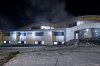
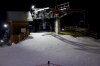
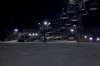
Yesterday I tried to shoot some skiing and surrounding area around 8PM, what means completely dark in this area. It supposed to be landscapes shooting in artificial lighting of lamps. Those lamps unfortunately vary a lot in colour temperature giving different tints of snow: from pink, blue to green depending on which area (which lamp's light) you point when setting the white balance. I tried to correct it but am not quite satisfied with the results.

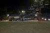
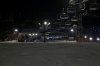
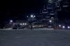
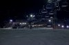
How do you handle this in postprocessing? Below I attach some shots to give you better understanding of the problem.
Please advise best methods. Should I simply select all the snow area and make it monochrome? :)

Shot with 5D2, 24-105 L, ISO 1600/3200, F4,5-7,1, 1/5-1/30s.
 

Attachments

  • IMG_4857.jpg
    IMG_4857.jpg
    1.1 MB · Views: 743
  • IMG_4859.jpg
    IMG_4859.jpg
    485.7 KB · Views: 687
  • IMG_4911.jpg
    IMG_4911.jpg
    1.2 MB · Views: 665
  • IMG_4861.jpg
    IMG_4861.jpg
    1.1 MB · Views: 670
B

branden

Guest
This is a very interesting idea you're working on. I have a question though: why try to white-balance-correct the artificial light of a fluorescent-lit landscape photo that is devoid of people? This is not natural light, and I think the images would be more powerful if you emphasized the otherworldliness and unease created by the artificial lighting of vast landscapes. As you stated, each light seems to have its own color temperature. This cannot be easily corrected, but I also do not feel its appropriate in this situation.

Color-corrected the photo is ideal in situations where you want skin tones to look like skin, but these photos are devoid of humanity, so I do not feel that a "correct" white balance has much to offer here.

Additionally, while the bottom two photos are fine, the first two photos could use another stop or two of exposure. I'm guessing that the camera's exposure meter was metering off of the bright pinpoint lights, but to me this does not feel correct for the images.

Anyway, to answer your original question, about how to color balance when the lights are multiple color temperatures, it is easiest in a tool such as Lightroom, but can be done in Photoshop as well.

In Lightroom, balance the photo for the predominate color temperature, so that at least one light source is making white light. Then use the exposure brush (it looks like a magic wand or something) to paint over the areas that are cast in different hues. Then turn off all the exposure changes, and use the filter palette to select the complementary color that will result in a white light.

In Photoshop, you need to do basically the same thing, but because there is no magic exposure wand, you have to recreate the tool using the spraycan and multiple layers and blending modes.

Hopefully this information is helpful. Please let me know, thanks
 
Upvote 0
Branden, thanks for your tips, I'll try in Lightroom following your instructions. In fact those were developed in Apperture (I was using DPP but currently testing Apperture).

The two first photos were a bit lighter - I cut them off a little bit. Attached first picture is corrected, the second one - original.

You are right - I also think, when there's no skin tone on picture or things don't look too warm when shot with AWB at the bulb light, it's not absolutely neccessary to be so puristic regarding the white balance. But since the lamps cover the much smaller piece of picture themselve, than the area they really affect, it creates some strange "artificial" and unreal effect I wish to avoid.

On this picture lamps on the left and right sides are about 2000K, in the middle 2100K. So the third attached photo is white balanced with 2050K. Too cold... None of the pictures' balances I like. It seems really uneasy task to correct it properly, as you say.

Thanks, +1
 

Attachments

  • 2050K.jpg
    2050K.jpg
    353 KB · Views: 1,386
  • original.jpg
    original.jpg
    339.9 KB · Views: 1,402
  • corrected.jpg
    corrected.jpg
    290.8 KB · Views: 1,407
Upvote 0
The first image probably is the "correct" colour balance, but sometimes right isn't always best. Snow will often look grey to the human eye in shadow, when there are bright lights around, because of the high contrast. As a digital sensor isn't as good as the human eye at high contrast, it makes the shadows look even duller. Artistically, I agree with everyone else, that the third one looks best and gives more of a feeling of a ski slope because of the cool temperature. The coolness helps to lift it also, so the shadows are less pronounced.
 
Upvote 0
Kernuak said:
Artistically, I agree with everyone else, that the third one looks best and gives more of a feeling of a ski slope because of the cool temperature.

Is it maybe also because the rest of the image became more blue/cool so the brain's color tolerance/perception interpreted the whole image as more natural although snow was not at all?

Following branden's suggestions I developed image again, now in Lightroom and performed some local hue and saturation corrections.
Is it better now? If so, which of new versions do you find better?
 

Attachments

  • Ltrm_2070K_Tint+9.jpg
    Ltrm_2070K_Tint+9.jpg
    651.3 KB · Views: 811
  • Ltrm_2000K_Tint+8.jpg
    Ltrm_2000K_Tint+8.jpg
    683.7 KB · Views: 815
  • Ltrm_2000K_Tint+7.jpg
    Ltrm_2000K_Tint+7.jpg
    677.7 KB · Views: 787
Upvote 0
marekjoz said:
Is it maybe also because the rest of the image became more blue/cool so the brain's color tolerance/perception interpreted the whole image as more natural although snow was not at all?

In many ways, that defines art. Art is all about perception, whether that perception is right or wrong is often irrelevant. How many people wow over HDR? Yet that isn't exactly a correct representation of reality in many cases either. Even people like me who try to process photos to how they remember seeing the scene don't get it "right" much of the time, as we often remember it how we want to remember it. Ultimately, there are only two people's opinions that count, the photographer and the viewer. Of course, the viewer is always transient, with a new one coming along every few minutes, often with a different opinion, based on their taste and/or perception of how the scene should look. As the transient viewer, I think I still prefer the third one of the original set, it has more punch regardles of being right or wrong. I would suggest going with the look that you like best and accept that not everyone will agree. It's always good to listen to what others think, as you may have missed something, but it's more important to go with your own vision, as you know the look you were after and will have your own style. Ultimately, you'll probably feel better about yourself, otherwise you may feel like you sold out on your vision in years to come.
 
Upvote 0