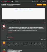
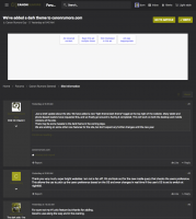
You might tweak the color scheme for the "Dark" style for people that are color challenged. There are three basic types: deuteranopia (green), protanopia (red), and tritanopia (blue). Protanopes like myself can't take advantage of the style given the current color scheme. These isn't enough color contrast. Here's some comparisons for people with normal color vision and protanopia for the Dark style that I created using Color Oracle on my Mac. Fortunately, mine is not quite quite this severe, I do see some red. For now I'll stick with the light style.
Many sites that were designed for a light style have a similar problem when displayed for a dark style. The "brand" colors they chose do not work well with the dark scheme, such as the reds in this case. My students are usually amazed when I show them how their web designs appear to someone that is colorblind during my lectures. It is an eye-opening experience.

Suggestion: Do not use your logo/brand color as a text color. Pick a color that works equally well on light/dark styles for those that are color challenged. Or use a pair of colors like normal text.
https://medium.com/eightshapes-llc/light-dark-9f8ea42c9081