Need help with group picture!!

I took this picture yesterday, and I really want to give this guys the best picture (and memory) possible.
So I would love to have some input from you guys on how to make the best out of this on Aperture or Photoshop.

So far I've done these changes:

Appreciate any help!
 

Attachments

  • Screen Shot 2012-08-29 at 13.33.01.png
    Screen Shot 2012-08-29 at 13.33.01.png
    21.7 KB · Views: 1,065
  • 12_08_URK_group_02.jpg
    12_08_URK_group_02.jpg
    1 MB · Views: 1,168

justsomedude

5Dm4, 5Dm4, 5Dm3, 6Dm1
Feb 20, 2011
432
3
47
Denver, CO
www.akphoto.com
Mt Spokane Photography said:
Your image is fine. Sharpness, vibrance, contrast, and highlights are just a matter of personal taste.
If you plan to print it, it will be fine as well.

+1

There's only so much you can do with a wide group shot like this. There are a few blown highlights in the banner and in some foreheads, so maybe tweak your recovery (or highlights, depending on which version of LR you have). But other than that it looks fine to me. Send 'er off to the client!
 
Upvote 0
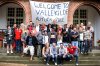
this might sound dumb, but i would crop a little off the right side. you can see the bricks from the vertical part of the arch on the right side, but not the left. little things like that really help to frame a picture.

one thing that i would definitely do is bring down the highlights on those guys in the front some more - not a global highlight reduction.

also, increase the definition just a tad. its very similar to the clarity slider in LightRoom, and they both really add "sharpness" and make the picture pop.

other things that i would to, which are of course to taste, would be to add a vignette.

also, a great trick i learned for aperture that sometimes looks amazing is this:

go to color monochrome - pick the crayon box - select mercury - take it down to 5% opacity in the color selector (not the adjustment pane) - finally, go to the adjustment pane and drag it pretty far down until you find something you like.

all in all it's a nice pic. pretty even exposure and everyone looks interesting.
 
Upvote 0
I did a few quick edits (not as nice as if i had the RAW file)

Cropped
Vignette
Lowered Highlights on the shirts up front
Tiny increase in exposure
Increase in Clarity (definition in Aperture) - probably a little too much, but I just wanted to show you what it does.
 

Attachments

  • My Take.jpg
    My Take.jpg
    2.3 MB · Views: 1,070
Upvote 0
Jul 30, 2010
1,060
130
Setazo said:
I took this picture yesterday, and I really want to give this guys the best picture (and memory) possible.
So I would love to have some input from you guys on how to make the best out of this on Aperture or Photoshop.

So far I've done these changes:

Appreciate any help!
With that many people, there will always be someone that does not look good or even turns the head tos omewhere else. Next time, you should take 5 to 10 pictures consecutively. Photo shop have a "photomerge Group Shot" function that you can "replce the indivual head from another picture. That will give you a better change to make everyboy in the picture looks good.
 
Upvote 0
.
Think about this:

1. If you don't do anything else, crop the top all the way down to eliminate the "Welcome To." That maintains the context and tightens up the overall shot. It also gets rid of all the distracting arch stuff. Immediately looks better to me.

2. You might add some dimension by darkening the background. You can take down the overall exposure a good bit. That will darken up those distracting window areas and it will recover some of the highlights in the people faces and light clothing. Then up the light in tone adjustments and take down the dark or shadows even more as needed. The challenge here will be to maintain detail in the black faces; that's always hard when dealing with blacks and whites.

Overall, a good shot. The only people problem is the dummy looking at his shoes -- but there will always be one and he'll live with his mistake every time he looks at this picture.
 
Upvote 0
The left window definitely requires perspective correction. All I could use right now was just DPP. I'd lower the contrast, increase shadows and decrease the highlights. It may look dull but when you go full screen it looks better as for my personal taste. The shirt of the girl below "A" is overexposed and each time I look at the picture it comes straight into my view.
 

Attachments

  • My TakeMJ.JPG
    My TakeMJ.JPG
    2.2 MB · Views: 949
Upvote 0
marekjoz said:
I'd lower the contrast, increase shadows and decrease the highlights. It may look dull but when you go full screen it looks better as for my personal taste.

It's amazing the different asthetics different folks are drawn to. I personally am drawn to detail, not color sat and contrast, so I too prefer a flatter look since to my eyes it reveals much more detail. The two black jackets in the shot are the most obtuse examples of more detail revealed imo. It's pretty cool we have software these days that can take it any direction you want go.
 
Upvote 0