You are using an out of date browser. It may not display this or other websites correctly.
You should upgrade or use an alternative browser.
You should upgrade or use an alternative browser.
Too much chroma?
- Thread starter sanj
- Start date
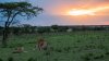
Interesting photo, particularly the action, expression of the mating lions, and observer in the frame, but I agree, it seems a little too punchy, especially since you lifted the shadows & midtones a bit. It also looks like there's a fair amount of vignetting in the top corners (I guess the bottom is cropped off) that give it extra contrast as well. Try reducing the reds just a bit, that should give you a better result. It also looks like the white balance is a bit cool - you might try warming it up a little.sanj said:Friends does this photo look like it has too much chroma? Does it seem over processed?
Pls pls do advice, I think this photo has potential but I do not want to kill it with over processing. Thx in advance.
Those are just the things I would do, but we all process our photos differently, so I'd tweak it until you're happy with it.
Upvote
0
Cool image. If it were mine, I'd probably paint some warmth over the foreground. It seems too cool compared to the blazing sky. Maybe add a little more contrast to the foreground, too.
I'd love to do a photo safari some day...
I'd love to do a photo safari some day...
Upvote
0
Thank you Mackguyver and Fametuer.
Excellent suggestions! I will implement.
Excellent suggestions! I will implement.
Upvote
0
Famateur said:Cool image. If it were mine, I'd probably paint some warmth over the foreground. It seems too cool compared to the blazing sky. Maybe add a little more contrast to the foreground, too.
I'd love to do a photo safari some day...
Yes you must do a photo safari. It is therapeutic! And it can be done with various budgets. Let me know if you need any advice.
")
Upvote
0
I agree with both of them, and I'd combine their advice. I'd warm the foreground, then I'd take the saturation of the whole thing down a notch or two. I'd probably dim the foreground a tad too, as it just looks to light given the sunset.
Upvote
0
Definitely seems over processed to me, sorry.
I must also agree with the previous comments, particularly the foreground being too light. The lions are so light that they look like they've been added in post from another image. The light comes from the background so my brain tells me they should almost be silhouetted and they are the brightest thing after the sun. The fact that the tree just beside them is darker (as it should be) only emphasize the problem and makes the lions look artificial. To my eyes, the chroma is much less of an issue than the inconsistency in the brightness.
On the other hand, I must agree with the image having potential.
Upvote
0
The foreground looks a little bit greenish-purple, I might try to warm it up a touch (not overboard, but a touch). The sunset has some parts that are a bit blown out, but it's tricky since if you save that then you might not have enough DR for the foreground. The saturation doesn't seem bad, sunsets can intense, even more than that.
It's tricky but maybe play a touch with foreground relative to bright sky relative brightness.
It's tricky but maybe play a touch with foreground relative to bright sky relative brightness.
Upvote
0
Upvote
0
sanj said:Friends does this photo look like it has too much chroma? Does it seem over processed?
Yes, it looks over-processed to me, but lowering saturation and raising vibrance often fixes this in no time. As others have mentioned, the foreground is too cold - use LR's gradient to warm it a bit, you usually recognize this situation if there's a strange cyan cast you cannot get rid of even with changing tint.
Upvote
0
I'm really not liking this one. The main problem I have with it is that the sun is the light source yet the ground is way too bright in comparison.
In that situation I would have tried to go to the left and lower to make the scene a true silhouette. I think you are stuck between a rock and a hard place with this one, if you process it to bring out the lions the sky looks weird and if you process it for the sky the lions are lost in their camouflage.
In that situation I would have tried to go to the left and lower to make the scene a true silhouette. I think you are stuck between a rock and a hard place with this one, if you process it to bring out the lions the sky looks weird and if you process it for the sky the lions are lost in their camouflage.
Upvote
0
It's a very nice shot, but I agree with some of the observations. What hit me was the bright, low-angle sun and light foreground, but no shadows in the foreground. The flat lighting seems to lose some depth. I'm not sure what you could do with that, maybe play with brightness a bit and see if it diminishes those problems.
On the other hand, it's a great capture and nice framing. It would be unfortunate to sacrifice a nice display of behavior on the alter of art.
Just my 2 cents.
On the other hand, it's a great capture and nice framing. It would be unfortunate to sacrifice a nice display of behavior on the alter of art.
Just my 2 cents.
Upvote
0
Thank you so much for the insightful comments.
Upvote
0
apply some gradient filters, one from the top, another from the bottom, and tweak to your liking.
This image won't respond too well to global adjustment.
LR or ACR front end in PS should be an adequate grad filter option.
This image won't respond too well to global adjustment.
LR or ACR front end in PS should be an adequate grad filter option.
Upvote
0
Re: Too much chroma? RAW ADDED.
Friends.
Here is the RAW. Am struggling with this one. Can anyone please take a shot at it? Thx...!!!
https://www.dropbox.com/s/f0cdxfhrslnj1dx/_70C0768.CR2?dl=0
Friends.
Here is the RAW. Am struggling with this one. Can anyone please take a shot at it? Thx...!!!
https://www.dropbox.com/s/f0cdxfhrslnj1dx/_70C0768.CR2?dl=0
Upvote
0
Upvote
0
Thank you so much Mackguyver.
I put both photos side by side and notice:
1. I did over do the chroma.
2. There is more contrast in my version which gives it a pop your version looks more natural.
3. The lions merge more in your version.
Great. I will wait a bit to see if anyone else gives me suggestions. After that I will re do this photo.
Upvote
0
Similar threads
- Replies
- 8
- Views
- 1K
- Replies
- 0
- Views
- 804
- Replies
- 29
- Views
- 5K