sanj said:
Aglet said:
Thanks for letting us play w your raw file.
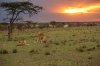
I don't know how the scene really appeared to you so I had some fun with it.
Some soft, romantic lighting, a little more of a skyscape to set the mood..
")
I compressed it a but too much but used 4:4:4 to maintain the quality a bit for the size.
I didn't bother with any NR, just a few basic tweaks and 2 grad's in LR5
Thanks Aglet for your time and expertise.
a) Does the image look to orange or in other words is blue missing.
b) Is the foreground bit too much?
Thanks for setting the mood. Lol.
HI Sanj
You're welcome, but I won't call me an expert, just implementing my version of how it could look.
Yes, i took a lot of the blue out of the image for a number of reasons.
I started by warming the whole image, then adding a lot of magenta to the terrain to get the grass to look yellow-green like it should. This also complements the color of the copulating cats.
But that left the look of the light from the sky being too cold to match the color of the foreground so I ran a warming filter on the sky as well.
My inspiration is where I live and shoot; we often get some very rich sunset colors bursting thru clouds like that. That light can reflect off clouds above and-or behind, filling the scene with a very warm glow that doesn't have the coolness of shade or shadow that it otherwise might.
It's just my personal taste but I think the warmer rendering of the scene helps tell the story of the lions a bit more, it's a setting we may not necessarily associate with cold looking light.
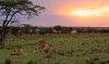
I didn't want to crop the image as I've left that to your discretion. Personally, I would remove the bottom 20% or so to eliminate all that flatness at the bottom. That would help bring your focus to the cats and the wider aspect ratio would give the viewer a few things to look at in the whole setting. This isn't a sterile or controlled studio shot and I think it shouldn't try to look like one. This is a type of documentary image, but you can tweak it to make it tell the story the way you saw it.
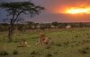
FWIW, here's my fully cropped version. I liked the wider crop with just the bottom removed, but there's a dead-patch in the right foreground that kept pulling my gaze to it.
So I carved some off the right side but left the crepuscular ray intact so it finishes in the upper right corner.
IMO, this gives the viewer a few things to look around at in the whole setting, but now the cats are prominent.
EDIT - hmmm this was just a quick hack crop using Preview and both images look the same using Preview on my system but now my FF browser is showing a different sort of gamma between my original and the crop, the latter looking darker. ah well, you get to see the crop.