A
Alumina
Guest
Hey Everyone! I'd like to show off my work a tiny bit. Anyone with tips and advice is welcome! (but don't be mean  ) and please bear in mind that I'm only photographing since November 2011, and only had a macro lens since February this year. Everything is shot with a Rebel t3i and a 100mm f/2.8 USM lens (the 500dollar one)
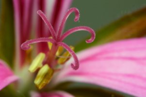
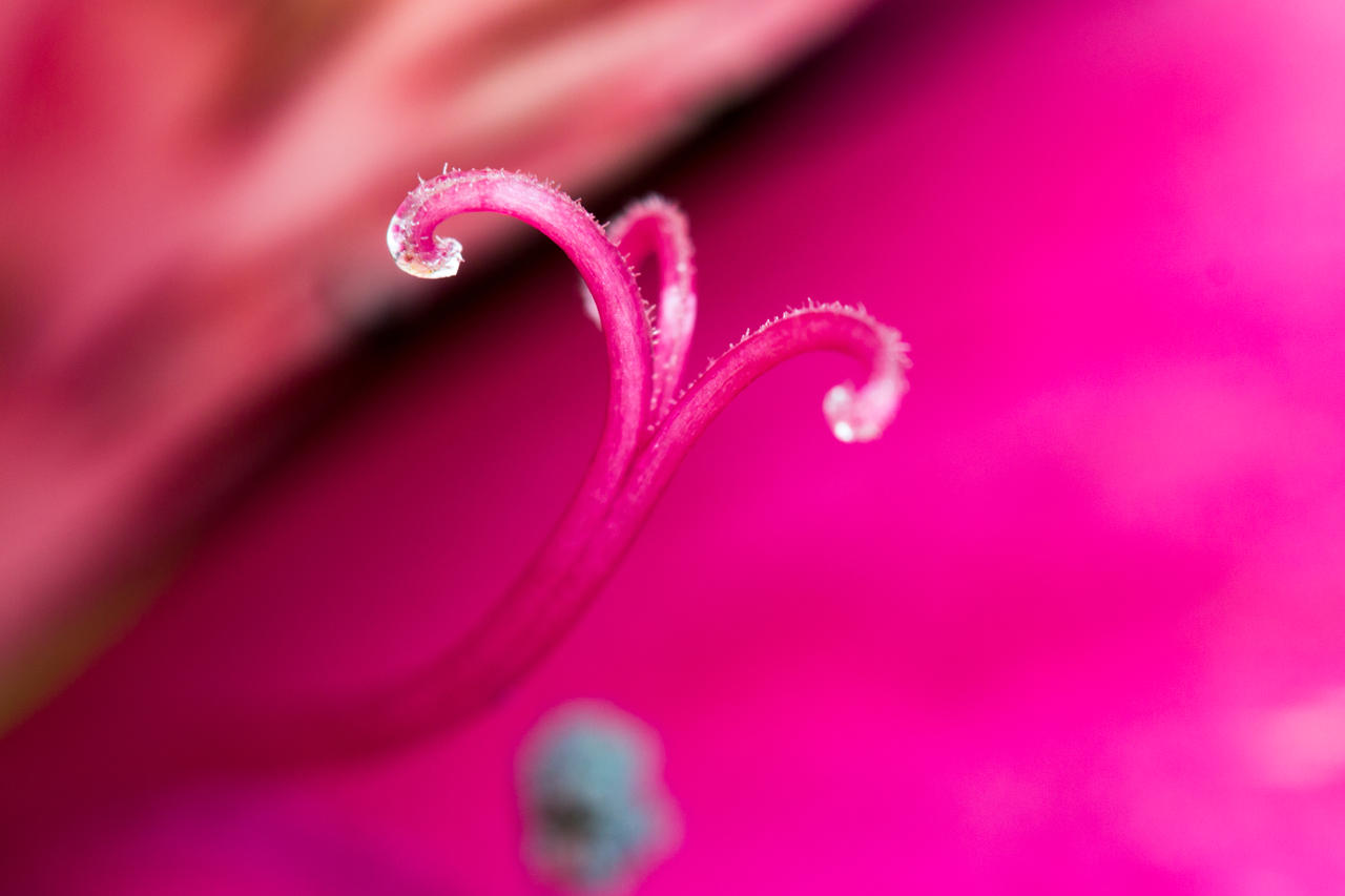
This shot is one that I'm the most proud of
1.
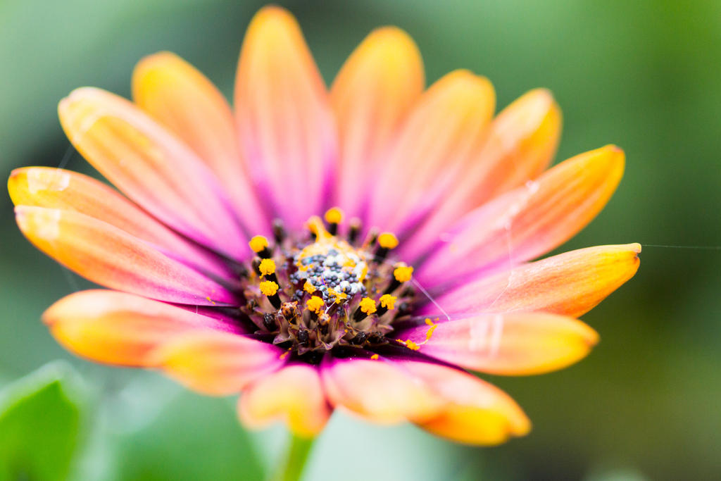
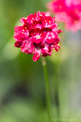
2.
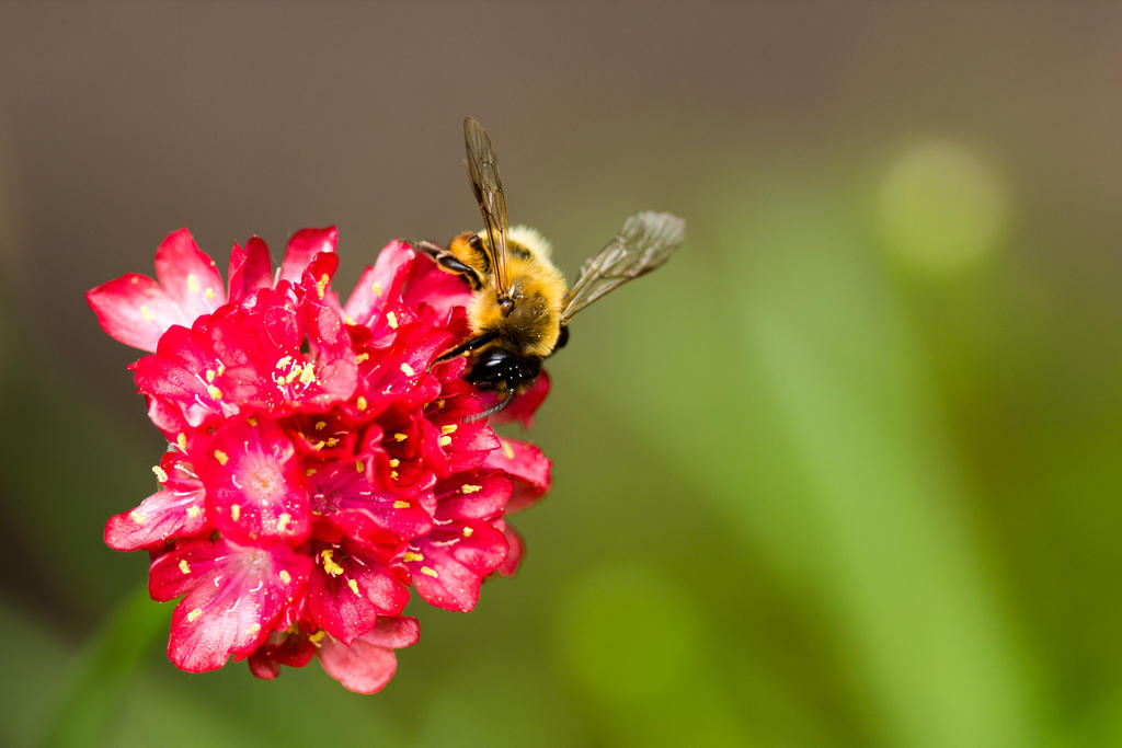
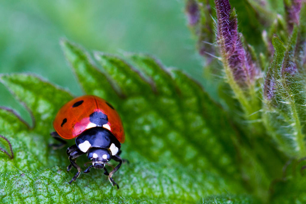
3.
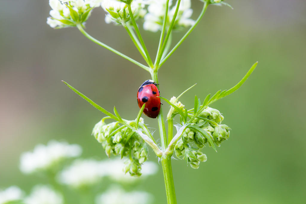
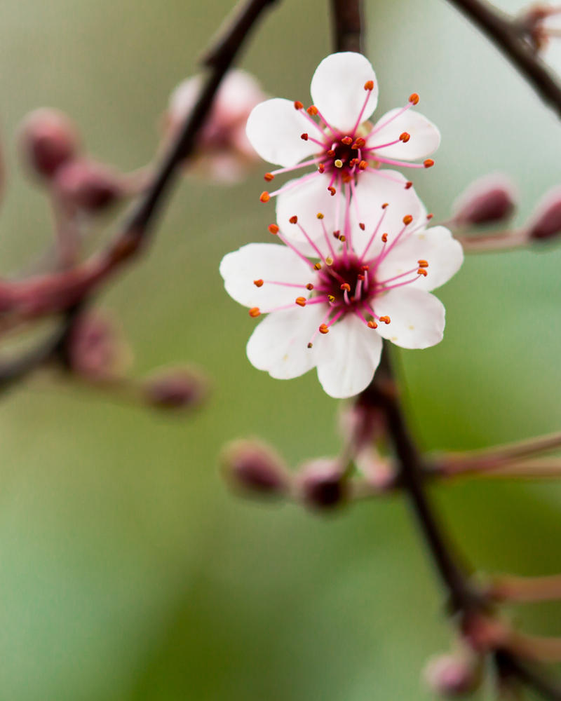
4.
5.
6.
7.
8.

And I have lots more, but lets not make a huge topic here. I hope to get some feedback from you guys!
You can find more of my work here:
Deviantart
Flickr
My Website
) and please bear in mind that I'm only photographing since November 2011, and only had a macro lens since February this year. Everything is shot with a Rebel t3i and a 100mm f/2.8 USM lens (the 500dollar one) This shot is one that I'm the most proud of
1.
2.
3.
4.
5.
6.
7.
8.
And I have lots more, but lets not make a huge topic here. I hope to get some feedback from you guys!
You can find more of my work here:
Deviantart
Flickr
My Website