You are using an out of date browser. It may not display this or other websites correctly.
You should upgrade or use an alternative browser.
You should upgrade or use an alternative browser.
new look for CR
- Thread starter pwp
- Start date
Oof, I like the new logo but the page graphics & layout with black & red blocks are pretty strident.
If you wanted to make it look like some kinda supa sekret undaground rumor conspiracy site, you succeeded") .
.
If you wanted to make it look like some kinda supa sekret undaground rumor conspiracy site, you succeeded
.
Upvote
0
Hah! Well perhaps that's a valid intention. The overall immediate effect certainly is a lot "harder"...funkboy said:Oof, I like the new logo but the page graphics & layout with black & red blocks are pretty strident.
If you wanted to make it look like some kinda supa sekret undaground rumor conspiracy site, you succeeded
Design is such a subtly powerful thing. But not to worry, CR is all about the content anyway.
We'll soon forget that it ever looked any different.
-pw
Upvote
0
First post here but long-time lurker.
One thing that has always annoyed me is the highlighted forum posts on the right hand side of the Home page. If you click on one, I find it annoying that it doesn't take you to the first post, but to some random place down the thread, often the bottom post. Can it not be fixed that it opens at the top of the thread?
On the other hand, there may be a good reason for this that I can't figure out...
Otherwise, the new look is great - well done!
Pete
Upvote
0
TrabimanUK
In the words of Brian Johnson - "Shoot to thrill!"
any chance of the rumours being higher up? Or at least the trending discussions being at the top of the page?
cheers
cheers
Upvote
0
")
Canon Rumors said:Ahh.. the first complaint didn't take long.
The switchover will be buggy for 12-24 hours as things get sorted. These things rarely go smoothly.
In the original version of this site, a list of products appeared on the right side of the screen and one could click on the link and view all of the rumors associated with the product. That cross-reference tool was very helpful. Nikon Rumors still has theirs and Sony Rumors lists related rumors at the bottom of every post.
Upvote
0
Thanks for your hard work - much appreciated.
Here are the things I am missing:
"Follow on Forum" link for the Blog articles - it used to be there right underneath the headline.
Clicking on "www.canonrumors.com/rumors/" results in a 404 not found error. Same for "http://www.canonrumors.com/submit-a-rumor/" submit a rumor link.
This worked last night. It was basically the same landing page but without the "reviews" and "rumors" dividing the 1st and 2nd entry.
But in general I really like the new changes
Upvote
0
L
Loswr
Guest
bereninga said:I like the new look! Not sure about the blank horizontal gray bar though.
That's a space for banner ads - if you have ad blocking, it'll be blank.
petefromzim said:One thing that has always annoyed me is the highlighted forum posts on the right hand side of the Home page. If you click on one, I find it annoying that it doesn't take you to the first post, but to some random place down the thread, often the bottom post. Can it not be fixed that it opens at the top of the thread?
On the other hand, there may be a good reason for this that I can't figure out...
It links to the most recent posts, not the first post in most recently active topics. An easy (and often overlooked) way to access topics starting with the post after the last one you personally read (which is the first post, if you haven't read that thread) is from the upper right corner of the forum pages.
Attachments

Upvote
0
i had the new site showing up last night, but now it's gone!!!
I love the new look, so I'm sad to see the old one back.
I love the new look, so I'm sad to see the old one back.
Upvote
0
neuroanatomist said:bereninga said:I like the new look! Not sure about the blank horizontal gray bar though.
That's a space for banner ads - if you have ad blocking, it'll be blank.
petefromzim said:One thing that has always annoyed me is the highlighted forum posts on the right hand side of the Home page. If you click on one, I find it annoying that it doesn't take you to the first post, but to some random place down the thread, often the bottom post. Can it not be fixed that it opens at the top of the thread?
On the other hand, there may be a good reason for this that I can't figure out...
It links to the most recent posts, not the first post in most recently active topics. An easy (and often overlooked) way to access topics starting with the post after the last one you personally read (which is the first post, if you haven't read that thread) is from the upper right corner of the forum pages.
Well, I for one can't see the point of that - if it's a new thread, I want to read it from the top, not navigate all the way back. And "upper right corner" - darned if I can see what you're referring to - must be blind!
Upvote
0
I see the MkII version of the new look CR is up. It's a far more modest effort than MkI.
Here's a reminder if you've forgotten..
http://www.canonrumors.com/forum/index.php?topic=17643.msg326443#msg326443
-pw
Here's a reminder if you've forgotten..
http://www.canonrumors.com/forum/index.php?topic=17643.msg326443#msg326443
-pw
Upvote
0
petefromzim said:neuroanatomist said:bereninga said:I like the new look! Not sure about the blank horizontal gray bar though.
That's a space for banner ads - if you have ad blocking, it'll be blank.
petefromzim said:One thing that has always annoyed me is the highlighted forum posts on the right hand side of the Home page. If you click on one, I find it annoying that it doesn't take you to the first post, but to some random place down the thread, often the bottom post. Can it not be fixed that it opens at the top of the thread?
On the other hand, there may be a good reason for this that I can't figure out...
It links to the most recent posts, not the first post in most recently active topics. An easy (and often overlooked) way to access topics starting with the post after the last one you personally read (which is the first post, if you haven't read that thread) is from the upper right corner of the forum pages.
Well, I for one can't see the point of that - if it's a new thread, I want to read it from the top, not navigate all the way back. And "upper right corner" - darned if I can see what you're referring to - must be blind!
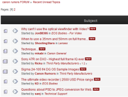
If you click on the subject of the thread, you'll be sent to first posting. If you click on the "NEW" icon, you'll be sent to your first unread posting.
Personally, I would really appreciate if CR could go away from red-on-black, due to the bad contrast makes it difficult for me to read the text (esp. the "Show unread posts since last visit" and "Show new replies to your posts" lines)
Attachments
Upvote
0
Similar threads
- Replies
- 58
- Views
- 6K
- Replies
- 46
- Views
- 6K