• The Canon Rumors Forum has officially been shut down as of July 10, 2026.

    All data will be deleted on September 16, 2026.

    the ad free experience will return by July 17, 2026.

New Canon USA Website

I just took a peek at www.usa.canon.com

Oh dear.

I used to be able to see all the lenses on a single page, with prices and basic details, lovely layout and SO much better than the awful UK site.

They've now nested everything... though they do give the prices against each lens unlike the UKs crummy offering which doesn't include MTF curves or prices. (HINT: CANON.. WE DON'T ALL HAVE BOTTOMLESS WALLETS, everything is about bang for buck, failing to put prices just makes work for your customers)

Edit: also, for readability text line lengths should be limited to around 50 characters... there are some horribly long lines on this new site.. much harder to read.

see https://wmich.edu/writing/readability
 
I completely agree. I left them the following feedback (upper left corner). If enough of us provide feedback perhaps they may fix this disaster.

"The new site is horrid. I definitely liked the old site better as I could see and compare all of the EOS bodies or EF lenses on a single page. Now I have to navigate 5 different pages before I see a body or lens. And then, I need to know exactly what I am looking for and how you have classified it. This new site is a huge step backwards in terms of user experience."
 
Upvote 0
Not sure why it is split up, but have you looked at the USA store? I agree, the new Canon USA site is clunky, used to be able to get to software and drivers right from the camera pages. http://shop.usa.canon.com/shop/en/catalog
 
Upvote 0
+1 The old site was much better. I just left them comment to that effect, gave specific example of problem (DSLR's are no longer listed on the "Professional Imaging Proudcts" page even though a 5DsR is shown as image to click-on to get to that page???) and summed it up as the new site is "IMPOSSIBLE".
 
Upvote 0
I agree that the new site is horrible and I also left feedback using the feedback link. It's really easy and quick to do and I encourage anyone who does not like the new layout of this website to provide your thoughts.
 
Upvote 0
New site is terrible, you can tell it was laid out by a web designer, someone you knows nothing about how a photographer may use the site. If you want, for now at least, go to www.canon.com and navigate to the Canadian page. It's similar to the way the site used to look, and way easier to use
 
Upvote 0
Re: New Canon USA Website hides software downloads sneakily

Looks like a web site designer's first try. Obviously they did no professional user testing. For example, when searching for software, drivers, downloads, 5DSR, nothing shows for El Capitan even though the software for Yosemite works, so your scratch your head a bit and finally find what you need. A warning should be given that the software is located under a previous op sys.
 
Upvote 0
I provided a feedback as well, hope they fix this.

I understand the need for a new design, yes the old one was a bit old, but still you could get to the information you want fast and easy, some few things needed improvement, but this is simply bad.

Although I liked the new theme, still I rated the design "Unsatisfactory", because the menus gotten more complicated, and things are taking more space while yes its clearer, less info is shown, which makes it not as useful.

And so its understandable that I rate the ease of use "Unsatisfactory" as well, too many clicks to get what you want, its slower, and too much scrolling to move around the page.

Now Content, wrong images are used everywhere, Drivers and Downloads is bad, recommended downloads is empty, duplicate items, and now if you go to a camera from the products page you don't get to software while you can get to all the information except reviews if you go to the same camera from downloads and drivers, unite them!

I haven't done a comprehensive test, but so far its bad, too bad.
 
Upvote 0
:( I tried to do a product comparison on the Canon EOS cinema page... selected three items, hit compare, and it promptly provided me with a null search result. No error message, just the compare screen with nothing in it. Left my comments.
Given the 'geek factor' of most of their customer base (no offense, CR folks!) they need to have this tested and debugged much better before launch... I hope it is just some ad agency and not indicative of the software testing provided by Canon! :-) and, the landing page is a design disaster.
 
Upvote 0
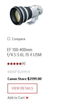
The new site may be graphically superior, but it's much more difficult to try and navigate. I have a feeling the average consumer has no idea how to find a lens on the site based on the criteria of "medium telephoto, telephoto, super telephoto" and that some zooms are not where they should be like the 100-400 1.4x on the super telephoto page? Why not telephoto zoom like the regular 200-400s?

Previously, everything was broken into categories from a main overview. Easy to understand where each lens was.
 
Upvote 0
Just got a new 6D, the web site has broken links to the Carepak-Plus promotion.

http://usa.canon.com/carepak-plus

Was looking forward to having free Carepak-Plus .

Design wise, I liked the old site better for some qualities like lens comparisons. I would prefer a simpler, less imagery cluttered interface.
 
Upvote 0
Agree. Awful "update". I just want to see the lenses. And I feel bad for newer photo enthusiasts. I've been shooting for decades and I know what a "medium telephoto" is - yet I'm still not trying to think through all those classifications when I'm browsing. All lenses on one page. Shouldn't be hard.
 
Upvote 0