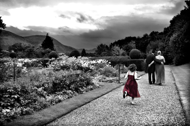
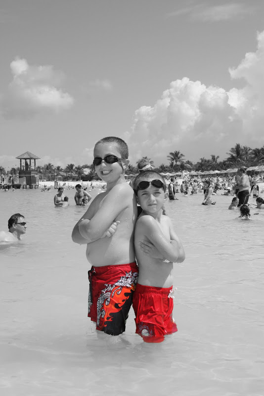
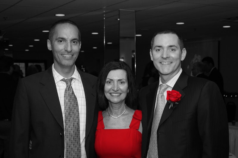
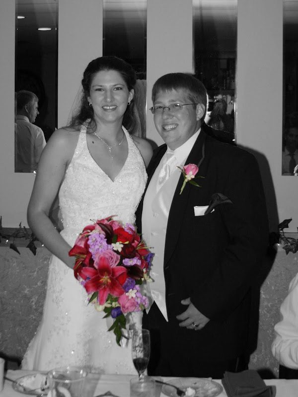
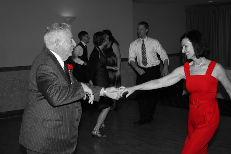
I would say i agree with other comments that the images need a little more B+W contrast. Also there is more to editing than this, simply adding the colour image and painting back the colour isnt enough for me. Its too obvious been done a million times and is far too bold, the lack of contrast in the B+W then the stark contrast of the colour is too intense.
A little advice, if you are shooting raw, process two versions of your images, one good colour, one good B+W, dont use the basic desaturate tools in PS, use the levels and the burn and dodge tool. Or go further and use layer masks. Depending on your ability, layer masks are alot more fluid painting the effect in with a softer brush at a lower opacity. But also once you have painted the effect in have you tried any blend modes? to try and make the effect a little less intense? overlay, screen etc and you can build up the effect by duplicating the layers. This will give you abit more of a fine art feel to the images and abit more velvety look rather than stark.
Tom Scott

")