You are using an out of date browser. It may not display this or other websites correctly.
You should upgrade or use an alternative browser.
You should upgrade or use an alternative browser.
Flowers and other Flora
- Thread starter dpc
- Start date
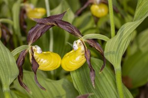
Thanks for helping me out!Nice picture of a geranium palustre.")
I'm good fauna but not so well at flora
")
By the way:
It has a funny German name:
Sumpf-Storchschnabel = swamp stork beak (as for the fruit looks like a stork beak)
I hope, I will keep this memorized


Upvote
0
Affinity Photo:

DPP4:
Affinity Photo:

DPP4:

I had to downsize these to Insert. I edited one version just using Canon presets in DPP4 along with a simple gamma adjustment. The other version went to Affinity Photo using their raw developer and messed with various sliders pretending I had any idea of what I was doing. I went with what I thought looked okay. Let me know which edits you like.
I’m very impressed with the RF 85mm f/2’s uncorrected raw files. Affinity had no lens profile.
DPP4:
Affinity Photo:
DPP4:
I had to downsize these to Insert. I edited one version just using Canon presets in DPP4 along with a simple gamma adjustment. The other version went to Affinity Photo using their raw developer and messed with various sliders pretending I had any idea of what I was doing. I went with what I thought looked okay. Let me know which edits you like.
I’m very impressed with the RF 85mm f/2’s uncorrected raw files. Affinity had no lens profile.
Upvote
0
Hi FamiliyGuy!
First, I really like the flowers and especially the combination of water lily and drops. Good eye, well done.
Second, I prefer photos that are not to much pp and overdone. Not only because I prefer the "natural" look but also because I am lazy.
Side by side they are too blueish for me and the colors of the DPP are much more natural. Especially when you look at the green tones of the leaves.
One thing that looks better to me with Affinity are the colors of the water lily blossom. But again the leaf to the right is too blue.
That's my two cents.
Disclaimer: I am using a monitor with color calibration (spyder).
First, I really like the flowers and especially the combination of water lily and drops. Good eye, well done.
Second, I prefer photos that are not to much pp and overdone. Not only because I prefer the "natural" look but also because I am lazy.
When it comes to your question I wouldn't have had any comments, seeing just the pics done with Affinity.Let me know which edits you like.
Side by side they are too blueish for me and the colors of the DPP are much more natural. Especially when you look at the green tones of the leaves.
One thing that looks better to me with Affinity are the colors of the water lily blossom. But again the leaf to the right is too blue.
That's my two cents.
Disclaimer: I am using a monitor with color calibration (spyder).
Upvote
0

Upvote
0
I think you’re pretty right on. If I understood the selection tool and layers better, I could probably do a better job selectively editing. Giving the flower and the background the different characteristics that best suit them.Hi FamiliyGuy!
First, I really like the flowers and especially the combination of water lily and drops. Good eye, well done.
Second, I prefer photos that are not to much pp and overdone. Not only because I prefer the "natural" look but also because I am lazy.
When it comes to your question I wouldn't have had any comments, seeing just the pics done with Affinity.
Side by side they are too blueish for me and the colors of the DPP are much more natural. Especially when you look at the green tones of the leaves.
One thing that looks better to me with Affinity are the colors of the water lily blossom. But again the leaf to the right is too blue.
That's my two cents.
Disclaimer: I am using a monitor with color calibration (spyder).
Upvote
0


Traveling to the Western US, the haze is really bad. Unfortunately it limits the grand vistas. Still managing some fun with the RF 15-35 I rented. I sent these to my phone with Canon Camera Connect app and edited then in Apple Photos. Might look different after I get home.


Upvote
0


Upvote
0
Me too, not many people would think of that composition.I really like this one. Well done!
Upvote
0
Upvote
0