Neon Bright Stockholm

Hello everyone. First I'd like to thank the forum for the inspiration given to me.

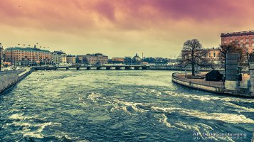
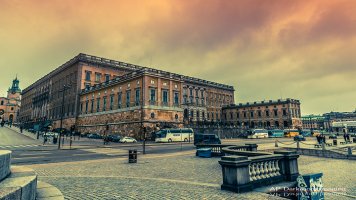
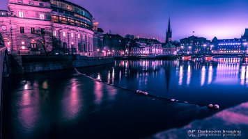
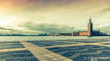
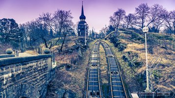
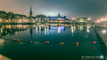
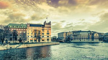
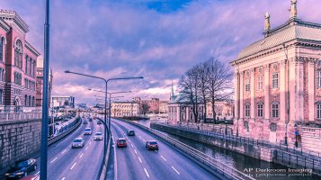
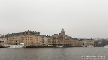
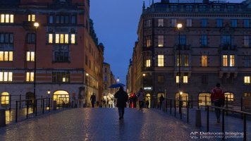
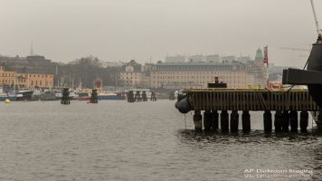
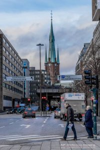
I would like to present you my latest project "Neon Bright Stockholm". I've been to Stockholm few days ago, and although I've liked the city, the climate was really cloudy and not photographically perfect.
In this project I portray the city of Stockholm under different light. The chosen colors are from one of my favourite periods: Miami in the 80's. The heavy tone retouching and the neon bright colors mirrors my idea.
Please tell me what you think. I'm extremely courious about it. :)

The whole project is here:
https://www.facebook.com/media/set/?set=a.817776884902726.1073741848.806331619380586&type=1

And a few photos will be uploaded on my 500px page in the next days, feel free to look at it and give me advices.
 

Attachments

  • IMG_8215.jpg
    IMG_8215.jpg
    391.7 KB · Views: 2,083
  • IMG_8191_1.jpg
    IMG_8191_1.jpg
    352.2 KB · Views: 2,053
  • IMG_8186.jpg
    IMG_8186.jpg
    310.7 KB · Views: 2,065
  • IMG_8238.jpg
    IMG_8238.jpg
    335.2 KB · Views: 2,053
I think you have some decent compositions here and perhaps the color toning improves on the bland light of the originals, which I cannot say..
But, IMO, I don't find this sort of look appealing enough to look at for more than a few seconds. But that's just one realist's opinion. :)
I like 8238, 8215 and 8191 but would have processed them quite differently to possibly make them more intriguing looking, again, just my opinion.
 
Upvote 0
Aglet said:
I think you have some decent compositions here and perhaps the color toning improves on the bland light of the originals, which I cannot say..
But, IMO, I don't find this sort of look appealing enough to look at for more than a few seconds. But that's just one realist's opinion. :)
I like 8238, 8215 and 8191 but would have processed them quite differently to possibly make them more intriguing looking, again, just my opinion.

Thanks for your suggestions. I've tried other combinations, but just to give an idea of the files I was working with, have a look at the attached pictures. Those are processed very lightly
 

Attachments

  • 1622285_817251378288610_1912033924_o.jpg
    1622285_817251378288610_1912033924_o.jpg
    29.8 KB · Views: 1,763
  • 1961778_817251221621959_1500588649_o.jpg
    1961778_817251221621959_1500588649_o.jpg
    509.1 KB · Views: 1,769
  • 1980089_817251518288596_1377941903_o.jpg
    1980089_817251518288596_1377941903_o.jpg
    42.5 KB · Views: 1,738
  • 1956959_817251834955231_903255734_o.jpg
    1956959_817251834955231_903255734_o.jpg
    70.6 KB · Views: 1,764
Upvote 0
I wouldn't do much to 8649, it's got a mood to it that comes across as-is.

The others have very flat lighting but I think they could first benefit from some local contrast enhancements, the strength of which you can vary until it suits your tastes.
After that, you might consider some color toning, subtle or not, to accentuate the look you're after.

It's all up to you, of course. There are so many processing options available to us these days.
And it is a good idea to solicit opinions from others, tho not necessarily just other photographers, we're a rather biased bunch. ;D
 
Upvote 0
I'm not a fan at all of the coloring of the first set. The colors are discomforting, not pleasant, and confusing as to how I'm supposed to feel about these scenes. The second set is much better, with exception of the ones that are completely overcast and grey. Maybe turning those into b&w would work.

These really illustrate how important quality of light is to photography. If the light is dead, the photos will be as well. Sometimes it's just not worth taking the shot if the light is that bad. I realize that sometimes circumstances don't allow for another opportunity to shoot a given subject but I always make every effort to find the right light first (waiting for it if I have to or returning at another time even).

I know from experience that there is virtually nothing that can be done in post to recover a photo from really bad light (without completely overdoing it of course). The most likely solution is to go to b&w and try to pump contrast up. For color, good light is critical.
 
Upvote 0
agierke said:
I'm not a fan at all of the coloring of the first set. The colors are discomforting, not pleasant, and confusing as to how I'm supposed to feel about these scenes. The second set is much better, with exception of the ones that are completely overcast and grey. Maybe turning those into b&w would work.

These really illustrate how important quality of light is to photography. If the light is dead, the photos will be as well. Sometimes it's just not worth taking the shot if the light is that bad. I realize that sometimes circumstances don't allow for another opportunity to shoot a given subject but I always make every effort to find the right light first (waiting for it if I have to or returning at another time even).

I know from experience that there is virtually nothing that can be done in post to recover a photo from really bad light (without completely overdoing it of course). The most likely solution is to go to b&w and try to pump contrast up. For color, good light is critical.

I get your point, and I know that if the light is bad the photo will be bad too. This is just an attempt to give a brand new point of view of the depicted scenes, even if the final effect is, indeed, innatural.
 
Upvote 0
Hi DKN, Brave person.

Lovely City, and your artistic rendition does you credit, it may not be to everyone's taste, that shouldn't concern you, the main issue here is do you like what you've done ??

As mentioned in an earlier post, it's always about light, in most of your Daylight Images you've clearly had very flat overcast light, your sort of behind the eight ball from the get go in these circumstances especially for the large view open City/landscape Images your attempting.

Once you decided to push the shutter your stuck with what you have, in a lot of the Images I see here considering the extremely flat light, an option may have been to go B&W, push the contrast up, work at getting one of those older style moody B&W images. Get out at night and look at Images that reflect the light from the City off the Cloud Base.

Another view might have been to concentrate on close in snapshots of the city, sections of buildings that are clearly Stockholm, I remember a load of old buildings in this city with Gargoyles on the lintels etc, these sorts of Images under flat light can be an option while you wait for a better light situation.

The pinkish toning will work for some viewers, but your fighting a battle with the traditionalists among the audience, I guess I'm somewhere in that crowd on the fringes, I do like art in photography (Infrared's Images on CR, Great stuff, and many others), but I'm not a HDR person, Images like the "Trey Rattcliffe" style of Imaging just doesn't work for me, but, you can't say they don't work for everyone as this particular chap (Trey Rattcliffe) has a huge huge following, and is almost the perfect example of how you take an interest in Photography and turn it into a multi million dollar business, very very smart chap.

Your Images remind me a little of his, so keep at it, develop your style, and the fact that your eager to have people critique your Images is a great sign for your future improvement.
 
Upvote 0
Many of the shots remind me of old postcards where the ink colors have faded non-uniformly. Interesting processing, effect might be enhanced by printing on linen or canvas finish "art" papers.

Light is the key, it's always tough to salvage shots from a gloomy day.
 
Upvote 0
I really like what you've done, especially considering the challenging light you started with. I think that kind of toning is especially effective for a big wall print, when its not the focus of the room, but you want a pink or other colour accent. good solution if you dont really want a picture of a pink flower or something. I agree with old-pr-pix, printing them on some kind of rougher media might work really well. Something like those aluminum prints might work really well too, in the other direction.
 
Upvote 0
DKN, again I think the "neon" effect can work, especially for the right audience. Frankly I don't even think any of these criticisms above, is all that harsh. What if one of our images had several hundred views and nobody said anything about it? It's because they didn't have anything good to say!
 
Upvote 0
DKN said:
Please tell me what you think. I'm extremely courious about it. :)

[....]

And a few photos will be uploaded on my 500px page in the next days, feel free to look at it and give me advices.

Aesthetically, this is just a matter of taste, so unless there's something about your photos you don't like and want help changing it's hard to give advice. The HDR look is something I hardly ever like, and as I rather like drab, gray light (preferably if it's raining or has just stopped, and better darker than lighter), my eye prefers the batch of photos you did only minor adjustments to (I probably like the person walking across the bridge at dusk with an umbrella the best); I would find the bleakness of that vast expanse of open space in 8238 (an image I like quite a lot) more effective if were much less colorful (monochrome might be best). (I would also note that if you're confronted by a boring pale gray sky and don't care for a rather bleak aesthetic, avoiding wide-angle shots with lots of sky is another solution - tight shots focusing on building details etc. with little or no sky will provide more visual interest.) But that's all just me. And in one or two I think the composition would look better with some cropping. But again, that's just me.

The only suggestion I have that's closer to being "objective" concerns perspective distortion - in a few of the photos (especially 8185 and 8186) taller buildings appear to lean back rather than in or upright, which sometimes happens when software "corrects" vertical distortion excessively. Maybe you like that look too, but it looks "wrong" to me (I tend to be rather fussy about horizontal and vertical lines).
 
Upvote 0
Thanks everyone! You really are a constructive community and you are helping me grow so much!

I would like to say to those who like more "close up" shots that, although I would have liked it much, I don't currently have any lens longer than 105mm, so it's a quite difficult task taking these kind of shots.

For the perspective, I actually like these curved, extended, stretched builing, because it gives me a pretty dynamic feeling of the place, it feels less static.

As for the post processing details, I pushed the shadows and pulled highlights, and later on I added clarity. Next, I have used the highlight panel on Adobe Camera Raw to add the color tonality and as last step, I’ve added a gradient filter with -2.0 exposure and red or brown color. All made only on ACR.

Next time I will try a little black&white as suggested. I'm not familiar with B&W, so I'll have to practice a bit.
 
Upvote 0