Portrait - Trying something new

Hello all, my wife and I primarily specialize in weddings and couple portraits. I tend to favor the only slightly edited, color corrected, photo journalistic approach, doing my best to capture the day as it really looked. I tend not to like the extremely post processed photos.

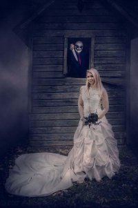
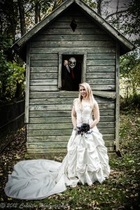
The downside to this, is that sometimes work calls for us to work outside of our comfort zone. When this couple told me they were into skeletons/halloween stuff, and they wanted to have their wedding portraits done at a cemetery, I grabbed the butcher knife (They had the masks) for the photo shoot and couldn't resist trying something new. We stumbled upon an old, beat-up outhouse, and everything was perfect in my mind's eye.

The problem is, this is way out of my comfort zone. How did I do in creating a horror-esque themed photo? Slightly desaturated, extreme clarity adustments... What should I look to change? Keep it as is? Thank you for any feedback!
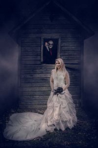
 

Attachments

  • 20121020-0718.jpg
    20121020-0718.jpg
    848.6 KB · Views: 2,184
Thanks for the tips. I may have to post a few more pictures of this same building, the building itself is very crooked. This made it extremely hard for me to get the picture "straight". This may sound stupid, but I think the leaning to the right is an illusion created by the building. The building itself leans, and the board on the right side is broken off, which makes it look even worse. Looking at the base of the building, and the right side (Not the broken board hanging away from the building)

As for cropping the top off the building... yeah, sucks I did that, but nothing I can do about it now. I will play around with some tighter crops and see how I feel about it. Thanks again.
 
Upvote 0
.
Three things I would try:

1. First, make his red tie or whatever that is more prominent. Bump up saturation, luminosity, etc.

2. Most of the roof is dead space. I'd pull the crop down to just above the second horizontal line above the window. That leaves the defining eaves yet makes the subjects more prominent.

3. Try cropping the bottom so the train slightly bleeds out the bottom -- as blood would do, so to speak. She may be in love with the train and want every square inch in the frame, but I think bleeding it off makes a more compelling shot given the whole point of the picture.

Thanks!
 
Upvote 0
I like your idea.
Here are some of my ideas or suggestions:
For a horror / Halloween theme I would make the image abit darker and use cold color tones. I would use more blueish color in the shadows to emulate how things look at night / dusk.
I took the liberty of doing a 5min edit in PS, I hope you don't mind. It is not the final product, I just wanted to show the concept and my idea.
 

Attachments

  • 20121020-0718edit.jpg
    20121020-0718edit.jpg
    52.8 KB · Views: 1,954
Upvote 0
OK, so my 2c are:

[list type=decimal]
[*]Your picture is focused on the bride but she is not on the one third line anywhere. Not the head, nor the figure...
[*]What is on the one third is the groom's mask and the bouquet...
[*]I think the crooked outhouse adds to scene...
[*]I don't think the cropped roof matters. You want the subjects to attract the viewer's attention (my opinion)
[*]Sorry, but I think that the knife looks a bit small. The mask looks more imposing to me...
[/list]

So (hindsight being 20/20) you could have had her step a bit to the right (your right) to get her to the one third vertical. Then frame the picture with the groom's mask (I keep saying mask as I have no clue if that is the groom ;) - whatever... Ignore this side chatter) on the vertical center as you have it now. And may be try and get the bouquet on the lower one third or close to that without cutting off the trail. Also leave enough grass visible in front of the gown.

Sorry, I am too lazy to edit the picture. As for the colors (or colours...) I think they look great. A more prominent tie would get the groom to be more prominent. You need to be subtle and not have too many attractive "things" that would confuse a viewer. The first should lead to next and so on...
 
Upvote 0
.
Personally, I like this better:

bride_house-L.jpg
 
Upvote 0
First of all, I would like to thank everyone for your input. I will definitely be incorporating several of the ideas into the final photo.

soydelafrontera said:
I like your idea.
Here are some of my ideas or suggestions:
For a horror / Halloween theme I would make the image abit darker and use cold color tones. I would use more blueish color in the shadows to emulate how things look at night / dusk.
I took the liberty of doing a 5min edit in PS, I hope you don't mind. It is not the final product, I just wanted to show the concept and my idea.

I'm at work right now. Mind if I ask for a brief rundown what you did for the smoke/haze/cloudy portions? Clouds filter? Either way, I'll give it another shot when I get home.

Distant.star: Thanks for your input. I can agree with your cropping suggestions somewhat... but for whatever reason, your crop just doesn't work for me. I just feel like too much of the picture is missing. I don't mind what Kernuak's done with the picture though, slightly cropping the top, so maybe I will try something in between your photo and my current photo as far as crop goes.

RPT: Thank you, you are correct that the photo is slightly off compositionally. I'll see if it can possibly be fixed with cropping, it's just one of those things... I still think the photo has promise, but it certainly could have been better if I took a little more time with it. You know how weddings go, quite a hectic day. I'm not sure about lengthening the knife, but it is something I will certainly try out to see how I feel about it.

Thanks again everyone!
 
Upvote 0
SteenerMe said:
Looks like its time for some off camera flash...the lighting needs some contrast to give it some real mood.

The groom is actually lit by a 430exII/PW Flex TT5 in the outhouse, albeit, very dimly. I didn't want him to be brighter than the bride, for obvious reasons. It may also ruin the creepy feel in my opinion. I agree with lighting the bride with some OCF, but time was short, and I didn't have a softbox handy, and I don't feel my shoot through umbrellas would have been the best choice for this type of shot, so I opted for natural light. Next time I'll try to be a little more prepared.

AprilForever said:
Great picture! One thing I would do: position the model slightly to the right, so her head is not intersecting the window sill...

I agree completely, but it's too late to reposition her now =) Just something I'll have to pay better attention to next time.
 
Upvote 0
roadrunner said:
RPT: Thank you, you are correct that the photo is slightly off compositionally. I'll see if it can possibly be fixed with cropping, it's just one of those things... I still think the photo has promise, but it certainly could have been better if I took a little more time with it. You know how weddings go, quite a hectic day. I'm not sure about lengthening the knife, but it is something I will certainly try out to see how I feel about it.
You are very welcome. Don't get me wrong, the picture has promise. A few tweaks and I am sure you will be happy with the outcome. About the knife, that comment was for any such opportunity in the future. I did not mean for you to edit the knife...
 
Upvote 0
rpt said:
roadrunner said:
RPT: Thank you, you are correct that the photo is slightly off compositionally. I'll see if it can possibly be fixed with cropping, it's just one of those things... I still think the photo has promise, but it certainly could have been better if I took a little more time with it. You know how weddings go, quite a hectic day. I'm not sure about lengthening the knife, but it is something I will certainly try out to see how I feel about it.
You are very welcome. Don't get me wrong, the picture has promise. A few tweaks and I am sure you will be happy with the outcome. About the knife, that comment was for any such opportunity in the future. I did not mean for you to edit the knife...

As a wedding photographer, if the opportunity arises again in the future that I need to start bringing along larger knives, I'm going to start to get worried ;D I grabbed the biggest one I had on the way out the door that morning, but maybe I'll have to pick up a larger butcher knife for future photo shoots.

I must admit, we got some crazy looks that day. A bride and groom with a photographer stalking them around a cemetery whilst carrying a butcher knife must look weird to some people. Not sure why. Thanks for your help.
 
Upvote 0
roadrunner said:
As a wedding photographer, if the opportunity arises again in the future that I need to start bringing along larger knives, I'm going to start to get worried ;D
As long as you are holding the knives and axes, no worry ;)

And you will need special gear to hold them. I wonder if CR is going to have a giveaway on a knife and axe belt ;)
 
Upvote 0
AprilForever said:
Great picture! One thing I would do: position the model slightly to the right, so her head is not intersecting the window sill...

I agree completely, but it's too late to reposition her now =) Just something I'll have to pay better attention to next time.
[/quote]

You could try to use the new content aware move tool in CS6, but it might be hard given the busy background, and lack of space for it to get a good match.
 
Upvote 0
rpt said:
roadrunner said:
As a wedding photographer, if the opportunity arises again in the future that I need to start bringing along larger knives, I'm going to start to get worried ;D
As long as you are holding the knives and axes, no worry ;)

And you will need special gear to hold them. I wonder if CR is going to have a giveaway on a knife and axe belt ;)

I'm not even kidding, that was one of the most difficult parts of my day! I was lugging around a ThinkTank Airport Security suitcase with all my gear in it... and couldn't for the life of me think of where to put this stupid knife. I didn't want to put it in one of the front pouches, for fear of cutting up my bad (They are just elastic on the front) and the inside was completely full... So I opted to hand carry it and get a little bit of unwanted attention.

Quasimodo said:
You could try to use the new content aware move tool in CS6, but it might be hard given the busy background, and lack of space for it to get a good match.

Thanks, I'll give that a shot, but I highly doubt I will like the results due to the background. It doesn't help that her head intersects the window either. I'll post an updated photo in a couple days when I have some off-time to work on it again.
 
Upvote 0