Portraits of my GF, Would like feedback!!

vlad said:
Haha welcome to the world of online critique! Hope you have thick skin and realize that ultimately it's all about expressing yourself through images, not following rules or seeking mass approval. It's great to get tips from people, but eventually, you have to follow your own intuition.
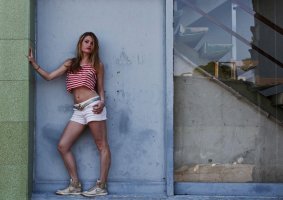
In some ways, that is probably the best advice in the thread. It is very important to develop your own style and if everyone did things the same way, photography wouldn't develop as an art and it would be pretty boring. That said, I think part of the reason the colours look a little odd, is because of the grey door, because you expect grey to be neutral, your eyes are screaming that something isn't right. Certainly, the colours don't look as off on the tree shots, even though I know they have been treated in a similar way. One other comment about colour, for me the idea of vintage and warm don't necessarily go together, rather, I think of low saturation or B&W when I think vintage, so that's something to consider. Compositionally, I think looking out of frame is ok and it is nice to see something different (I have tried something similar and got criticised). However, I think it would work better if you included the whole of her neckline instead of cropping quite so close. For the full length shots, have a go at cropping the left and top, so that the wall is removed and see what you think. Cropping is always a matter of personal taste to some degree, but I think thre are some rules that are worth following or at least considering. I'm not really a portrait photographer, but some rules of composition follow through to a number of types of photography.
 
Upvote 0
How does this look to you? You may want to look at distortion correction, as the crop accentuates it and make it look like the camera wasn't level (even though the centre column shows it is), but it gives you an idea of how the crop and different processing looks.
 

Attachments

  • 7161755882_1b0271e23e_b.jpg
    7161755882_1b0271e23e_b.jpg
    73.7 KB · Views: 3,000
Upvote 0
N

n0iZe

Guest
You wanted feedback: here you go!

Photo 1:
+ framing
+ background
+ model looks natural

- post processing came out horrible, giving it a plastic look
- too few DOF, try using smaller apertures for portraits, since the background is beautiful but distracting

Photo 2:
+ nice background
+ smile looks cute

- yellow thing in the down left corner is awful. Maybe cropping it a little would help, just above the yellow thing
- post processing makes yellow thing look even worse
- post processing takes away natural look
- too few DOF as above

Photo 3:
+ good photo
+ like framing, like pose, like the background

- try to improve your position, so that the horizontal and vertical lines look straight. I think you got the horizontal thing pretty good, but the vertical one not so much. I'm sure a step to the left would've helped solve this.
- don't make her look that dark, especially not the hair. I like the darkness on the clothes (except for the Nike Dunk - these are cool but you almost don't see 'em after processing), but the hair is too much imho.


Please don't take this as an insult, this is intended to be constructive feedback.

n0iZe
 
Upvote 0
photoxication said:
Gpf06 said:
Wow for all the response. I'll definitely appreciate the advice! As far as my overall look, I wasnt going for a traditional portrait. I wanted the pictures to look warm and a little vintage.

@vuiling - lol well I hope your eyes feel better! as far as the picture not having contrast, I would definitely disagree. That foreground is a light leak from the sun, not dirt. Why were you dissapointed that they were taken with a mark iii??

@axil - Thanks man, I really appreciate it :) Ill definitely work towards getting my subject to pop more!

@pdi - Haha yeah I can see what your saying about the arms.

@ker - Thanks, I'll definitely try using more curves in the future

Question - why do you think the first pose looks awkward?? I can see how her arms in the second shot look cut off, but the first I really enjoy. I understand that you guys are saying the post is done too warm, but would you really be able to tell had I not posted the before pics??

Once again thanks for all the feedback. keep it coming! In a constructive way.... :)

Clearly you have balls of steel to ask for C&C and post your work here. Very nice model! Don't listen to vuiling's comment on the 5D III and disappointing images. Who cares about what camera you use, just get out and shoot something! Disregard vuiling's whole post. I've never had an image online actually "hurt my eyes". That saying is in poor taste, and won't do anything to help you improve your photography techniques. I agree that the skin tones do look underexposed. My favorite composition - the full body portrait in the doorway. Do some more like that, I think your onto something there.

+1

Although I don't love the post-processing, it's your style so really who is to tell you otherwise (though I certainly wouldn't get rid of your gf's freckles, if only to keep a happy home).


Actor Headshots NYC | Gotham Family Photos | NY Wedding Photography
 
Upvote 0

pwp

Oct 25, 2010
2,530
24
Nice shots, and that's the main thing. As others have said, your PP has done you no favors.
Your "before" shots look a lot better than the "afters".

But stay with it and keep posting shots. Available light is great so long as it's nice available light. Use of reflectors can lift a "muddy" location to a completely viable one. Always look closely at the light on the face & particularly the eyes. They're the window to the soul...

PW
 
Upvote 0
ishdakuteb said:
here is my quick edit on your gf images. i am not sure whether you like it. however, i am still searching for a better way in editing it; therefore, any other comments on my editing will be welcomed.

I'm sorry, not offense but these edits are a little harsh. Why is she glowing in the first image? Completely over processed.
 
Upvote 0
S

SandyP

Guest
Unless it's a special creative shot that has the main focus being some sort of fantastical editing (like a "magic" or "fairy tale" kind of edit/shoot) then the edit should not be the most obvious/glaring thing you notice about the photo. Those three shots are way too over "cooked" in my opinion. You shouldn't have to edit the heck out of very basic shots like that to keep the viewer interested. And if you do, then there's a problem there.
 
Upvote 0
pdirestajr said:
ishdakuteb said:
here is my quick edit on your gf images. i am not sure whether you like it. however, i am still searching for a better way in editing it; therefore, any other comments on my editing will be welcomed.

I'm sorry, not offense but these edits are a little harsh. Why is she glowing in the first image? Completely over processed.

thanks for your comment, like i have said "i am still searching for a way to edit images" :) may be i have read/and see too many pictures of brian peterson. it would be nice as if you would show me a way of editing it by posting fix(es) to my editings, in that way i could learn more. thanks in advance...

note: i am learning how to edit image on my own via picking brains; therefore, i need to see lots of comments as well as before and after pictures...
 
Upvote 0
ishdakuteb said:
pdirestajr said:
ishdakuteb said:
here is my quick edit on your gf images. i am not sure whether you like it. however, i am still searching for a better way in editing it; therefore, any other comments on my editing will be welcomed.

I'm sorry, not offense but these edits are a little harsh. Why is she glowing in the first image? Completely over processed.

thanks for your comment, like i have said "i am still searching for a way to edit images" :) may be i have read/and see too many pictures of brian peterson. it would be nice as if you would show me a way of editing it by posting fix(es) to my editings, in that way i could learn more. thanks in advance...

note: i am learning how to edit image on my own via picking brains; therefore, i need to see lots of comments as well as before and after pictures...

I would focus on taking great exposures/ compositions in camera and just use "post" for correcting lens distortion, contrast, color balance, sharpness, noise reduction, etc...

Be creative in camera first. Once you are comfortable in that, becoming more creative in your post work can come next.

This is obviously just my opinion. I am not a professional photographer (full-time), but I am a professional artist/ graphic designer. I spend every day sitting at a computer working in Adobe CS programs- maybe that is what I love about photography, it gets me away from the computer! :)

Photography and digital image processing are really 2 completely art forms to learn and master.
 
Upvote 0