You are using an out of date browser. It may not display this or other websites correctly.
You should upgrade or use an alternative browser.
You should upgrade or use an alternative browser.
Print that! 
Upvote
0
Off to a good start! Welcome aboard, I'm looking forward to seeing more of your images.
Awesome! Beautiful picture. Well done, CvH.
Many thanks for the positive feedback!!
Upvote
0
Well you make a very good first impression! Well done. I always found Vietnam/China to be exceptionally photogenic, though personally I think I might have framed it with less foreground and more space above the tree. But generally I hate when people say things like that so I'll shut up and just say welcome to the forum.
P.S. Although it isn't strictly B&W the very muted colors fit the thread.
Really appreciated your kind words and constructive feedback! Now you mentioned the cropping and I agree that there is a little too much negative space in the foreground. You are also right regarding it isn’t a true bnw photo.
Upvote
0
Upvote
0
Very nice ! If I had to choose, of the three I'd pick the lastThank you! I am actually considering to print that photo and the following 2 as a set.
View attachment 193605
View attachment 193606
Upvote
0
I really like your pictures. Well done, CvH.
Thanks a bunch Click!!
Upvote
0
Very nice ! If I had to choose, of the three I'd pick the last
Thanks heaps for your feedback Sporgon!
Upvote
0
Thank you! I am actually considering to print that photo and the following 2 as a set.
View attachment 193605
View attachment 193606
Excellent set! Great tones and compositions. If I had to choose just one of the three, I'd likely pick number 1 but I like them all.
Upvote
0
Excellent set! Great tones and compositions. If I had to choose just one of the three, I'd likely pick number 1 but I like them all.
Thanks a lot for your feedback!
It’s interesting to hear that you prefer the 1st photo as oppose to @Sporgon that he likes the last one. I would love to know why you pick 1 over the other 2.
Upvote
0
Beautiful BNW photos!
Upvote
0
Thanks a lot for your feedback!
It’s interesting to hear that you prefer the 1st photo as oppose to @Sporgon that he likes the last one. I would love to know why you pick 1 over the other 2.
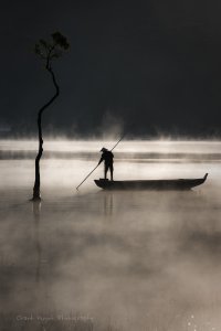
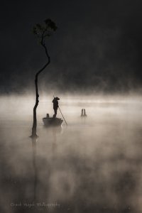
I think number 2 might work slightly better in landscape orientation because of the side-on position of the boat. From a strictly minimalist point of view, I think the third object in number 3 (piece of driftwood?) is unnecessary, although its diagonal position in relation to the other two elements forming a line from the bottom left of the picture to the upper right is excellent. The monochromatic sepia (copper?) toning works well for me. I would personally leave the negative space as it is. With everything said and done, though, all three are excellent photographs that you should be proud to print and hang on your wall. Excellent work on all three.
Upvote
0
So wonderful!!!Thank you! I am actually considering to print that photo and the following 2 as a set.
View attachment 193605
View attachment 193606
Upvote
0
Upvote
0
I think number 2 might work slightly better in landscape orientation because of the side-on position of the boat. From a strictly minimalist point of view, I think the third object in number 3 (piece of driftwood?) is unnecessary, although its diagonal position in relation to the other two elements forming a line from the bottom left of the picture to the upper right is excellent. The monochromatic sepia (copper?) toning works well for me. I would personally leave the negative space as it is. With everything said and done, though, all three are excellent photographs that you should be proud to print and hang on your wall. Excellent work on all three.
Huge thanks for sharing your feedback and I totally agree with your comments. I do have a landscape version of the number 2 photo but it lost the mysterious mood and doesn't match the vertical layout of the other 2 photos,.
I also considered clone out the piece of wood but thought that would leave too much negative space on the right?
Upvote
0
Similar threads
- Replies
- 4
- Views
- 251
- Replies
- 1
- Views
- 248

