First landscape submitted for critique

Dec 6, 2012
76
0
5,161
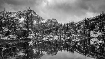
I am hoping to get some constructive feedback on this image. Positive and negative feedback are welcome. I have been shooting landscapes seriously for the past 1-2 years. My goal for 2013 was to shoot all of my landscapes in raw and learn Lightroom.

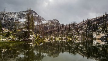
This picture was taken yesterday on a hike in Montana. The light was blah until some rays of the sun broke thru a small opening in the clouds for a few seconds and highlighted the rocks on the shore. Luckily I had my camera on the tripod and was able to swing it around a grab this shot before the light moved on. I hope the picture captures a little part of the actual beauty compared to seeing it in person. The picture was shot in raw with a 5DMkIII and 24mm TS-E. No tilt or shift and editing consisted of minor adjustments in Lightroom and small amount of cropping.
 

Attachments

  • IMGL3050.jpg
    IMGL3050.jpg
    2.7 MB · Views: 1,716
Great location and composition is interesting and balanced - I like it a lot.

With landscapes, it is not what you photograph, but when. I'm positive if this was shot with early morning or late afternoon golden light hitting those cliff faces and not with flat dull lighting ("argh" as you described), this would be a really special photo. But you can only capture what is in front of you at the time, and I think you have done that well.

On days like this, I often put on a polarising filter, and then convert to black and white - it can give the "flat" image a bit of a "pop".
 
Upvote 0
The pic looks good as it is now IMO.

It is hard to say what you could have done differently because you didn't give us much detail about what you did in lightroom.

I know I would have worked as much as possible to pull as much detail in the clouds and cloud reflection in the lakes as possible in light room. If you started with a bland gray sky and what we see now is what you were able to work to then good job. If this is what you started with you might be able to play with the settings to pull more out.
 
Upvote 0
You might consider a widescreen crop...crop out the sky just a bit above the tallest tree on the left. (As is my eye is drawn to the bright clouds in the sky.) What remains brings out a weird winding horizontal push-pull. Neat.

And I really like the muted colors, but I'm wondering if a polarizer could have reduced the harsher glare from the rocks.
 
Upvote 0
You have lots of detail in the image, showing some nice textures in the rocks and trees, but it looks like you may have had some water on the lens, as there is a faint flare above the crag just to the right of centre. For me though, it lacks a focal point of interest, mainly because of the light. The composition would probably work on a still dawn, where the reflections are much more prominent. Even better, if light shone through the clouds to pick out a feature, the ridge line would be ideal, as that would then also be prominent in the water. The location has potential in the right lighting, but as it stands, it is missing that little something that pulls it out of being a nice scene to outstanding.
 
Upvote 0
Kernuak said:
You have lots of detail in the image, showing some nice textures in the rocks and trees, but it looks like you may have had some water on the lens, as there is a faint flare above the crag just to the right of centre. For me though, it lacks a focal point of interest, mainly because of the light.

Thanks for the feedback. I did notice the flare and fixed it with the healing brush in Lightroom. Here is the B&W for a comparison.
 

Attachments

  • B&W.jpg
    B&W.jpg
    3.1 MB · Views: 945
Upvote 0
jrda2 said:
Kernuak said:
You have lots of detail in the image, showing some nice textures in the rocks and trees, but it looks like you may have had some water on the lens, as there is a faint flare above the crag just to the right of centre. For me though, it lacks a focal point of interest, mainly because of the light.

Thanks for the feedback. I did notice the flare and fixed it with the healing brush in Lightroom. Here is the B&W for a comparison.
I think it looks better in black and white.
 
Upvote 0
only suggestion is either go 50/50 for symetry, or perhaps include soem foreground in the shot- The 24mm lens is fairly wide, and including somethign in foreground like an interestly textured rock, or fallen gnarly tree or even a small puddle or something woudl help provide a 'stepping stone' into the photo (and give the eye soemthign to compare to the 'grand scene', adding a little visual interest, and being related to the scene somehow ie: let's say for example that the mountain was a semi active volcano, and htere was a steam vent in foreground with lava rocks nearby- these foreground elements would 'tell the story' of 'volcano' and lead the eye into the scene in anticipation of seeign hte actual volcano in the distance- just a for instance- where this is just a mountain and lake, maybe include something 'lakey' or 'mountany' in the foreground, like perhaps a stream flowing out of hte scene leadign hte eye up to the water and eventually to the mountain

However, if you're goign for an 'abstract' 50/50 look, mirror look- then yeah, none of hte foregroudn stuff applies- If so, not sure your feeligns on post processing, buit a little dodge and burning on a black and white, vignet, would help direct view inwards towards middle- but don't overdo it- be subtle- a little goes a logn ways
 
Upvote 0