First landscape submitted for critique

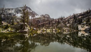
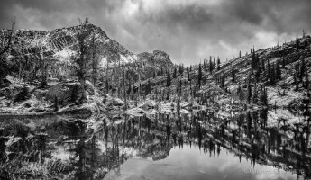
Very nice picture, the many verticals make you look twice and again. I think the colors in the original shot are as close to b/w as you need to be, and personally I think the b/w version is a lot less interesting. Do agree with the symmetry thing, horizon should've been higher in the shot.
 
Upvote 0
I initially cropped some of the bottom of the picture to bring the shorline closer to the bottom 1/3 line. Do you like this version better with more reflection shown?

duydaniel said:
I feel dizzy looking at the water though
Can you wait for when it was absolute still or something?

Unfortuanately not possible - wind was blowing, and this was the best it got.
 

Attachments

  • IMGL3050.jpg
    IMGL3050.jpg
    2.7 MB · Views: 813
Upvote 0
I find the composition quite challenging of both versions; my eye doesn't move around the picture in a controlled way but darts about. Not helped by the busy reflections.

I think if it were mine I would loose some of the left hand side of the picture and crop in a little, more or less as below.

Pity about the light in such a beautiful place but that's life.
 

Attachments

  • IMGL3050crop.jpg
    IMGL3050crop.jpg
    294.8 KB · Views: 603
Upvote 0
I agree abotu hte eye dartign about too much- The crop you did is more relfective of a 50/50 mirror split- and so does help some- but again, a bit of vignetting might help if you're not averse to some pp 'help' - there's just so much crisp detail that it's a bit too busy I think- or soem very selective dodge and burn could hep direct eye about a little better instead of wantign to dart about- other than that- I liek hte crop version a bit better-
 
Upvote 0