You are using an out of date browser. It may not display this or other websites correctly.
You should upgrade or use an alternative browser.
You should upgrade or use an alternative browser.
Little girl looking at flowers
- Thread starter Vossie
- Start date
Thank you Dylan!
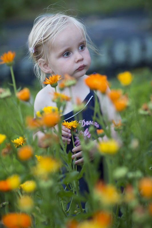
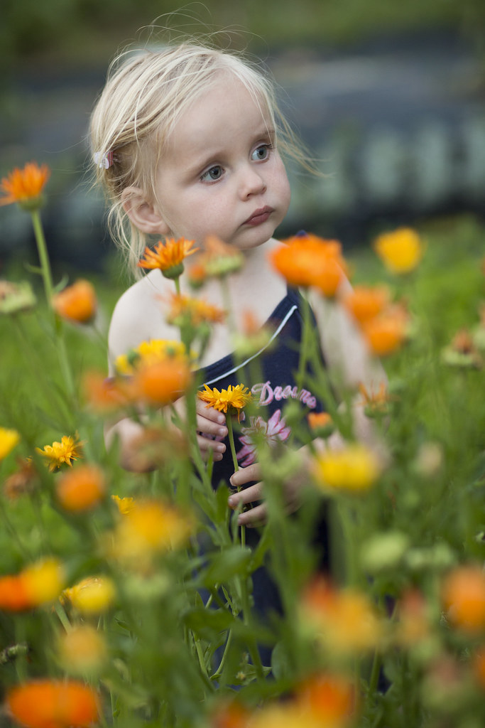
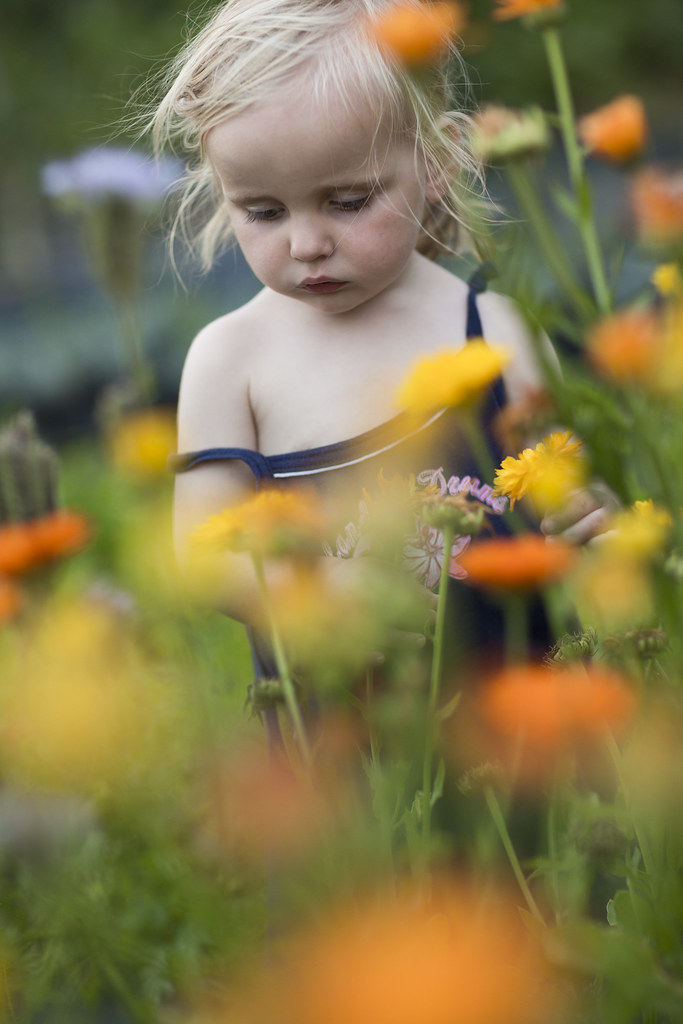
Here is 2 more of the same model (my youngest daughter).
5D3 with 40mm 2.8, 1/1250, f/2.8, ISO100
5D3 with 100mm 2.8L, 1/125, f/2.8, ISO800
@ Tanispyre, I agree that the colors on the flower image are a bit too cold. There wasn't much light left when I took the shot, but you're right I need to work on it a bit more. Thanks.
Upvote
0
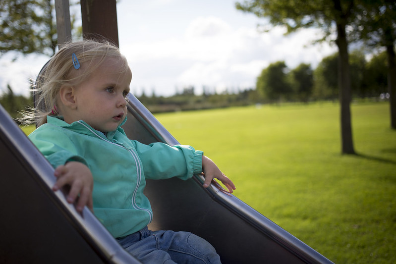
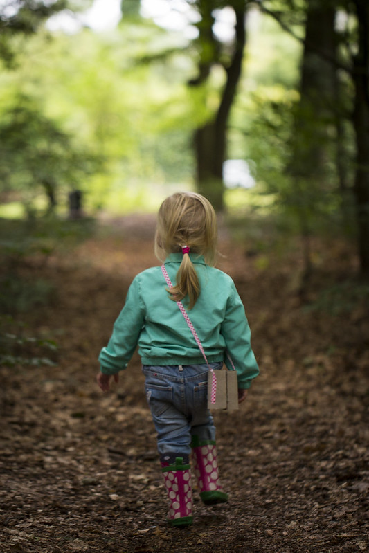
JonAustin said:Beautiful little girl, Vossie. Love the image of her walking away in those boots!
Ditto!
")
Upvote
0
Priceless!Vossie said:Taken around sunset. 5D3 with 85 1.2L II, 1/160, f/2.0, ISO800, natural light.
It put a smile on my face, not at all an easy feat before my first morning coffee.
I first came here because this is a top notch gear site, but not being a technophobe limited my contributions and interactions, until I discovered the image galleries.
Out of the blue image contributions such as this are pleasantly refreshing
Upvote
0
Very cute and beautiful! Love the first and third shot in which she is walking away in the boots. Good job!
Upvote
0
Beautiful images, but JD you are right. It is a little blue, which I am guessing the OP might have done to prevent the oversaturation of the orange flowers. One obvious way would be to warm the image and lower the saturation of the orange and yellow channels.
This might not be applicable here, but a friend of mine had excellent prints of Bryce and Arches, with one problem- too much yellow and orange saturation. He was just using DPP and when started using LR, he was able to balance the colors perfectly.
You have a great model, Vossie. God bless!
This might not be applicable here, but a friend of mine had excellent prints of Bryce and Arches, with one problem- too much yellow and orange saturation. He was just using DPP and when started using LR, he was able to balance the colors perfectly.
You have a great model, Vossie. God bless!
Upvote
0
jdramirez said:I expected it to be warmer... It has a blue tone... my phone maybe?
I agree its a nice shot but I think you should warm it up a bit
Upvote
0
Thanks All for the suggestions. I agree it needed some warming. As pointed out by sagittariansrock, it was not easy to find the right balance between the right color temp for the skin tones and the flowers.
In the below edit, I increased the color temp from ~7700K to ~12000K and reduced the saturation of the red, yellow and orange by ~20. Do you think this is better?
I feel they lack a bit of a punch. If anyone of you is better at raw processing then me, feel free to have a go at the raws (IMG_6376.CR2 / IMG_6381.CR2), I would very much appreciate if you could send the the resulting xmp files.
Upvote
0
JonAustin
Telecom / IT consultant and semi-pro photographer
Vossie said:In the below edit, I increased the color temp from ~7700K to ~12000K and reduced the saturation of the red, yellow and orange by ~20. Do you think this is better?
I feel they lack a bit of a punch.
The revised version also looks good to me, but I didn't really have a problem with the original version. IMHO, it all depends upon the kind of mood you wish to convery.
Not sure what you mean by "lacking punch," but I certainly wouldn't be the most skilled post-processor among the members here to try to improve on your work, anyway.
Simply adorable!
Upvote
0