Newbie - My shots your thoughts

Hey guys,

So I've been lurking this forum and the site for eons, and think I finally have enough photos that I would say I am proud of that I'd like to see what your thoughts are on them. While I would love to have a larger kit of lenses, I'm saving up for other more pressing financial requirements first. However I do think that what I'm able to capture at least has a certain emotion (or so I hope/think).

I lay myself to the CR courts, have at it.
Jay


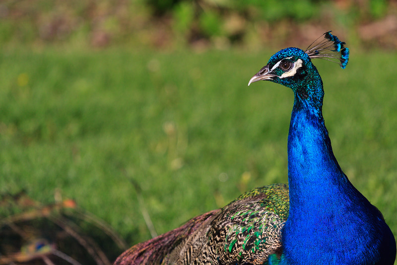
You Can Tell He Won't Look Away by Joynt Inspirations, on Flickr


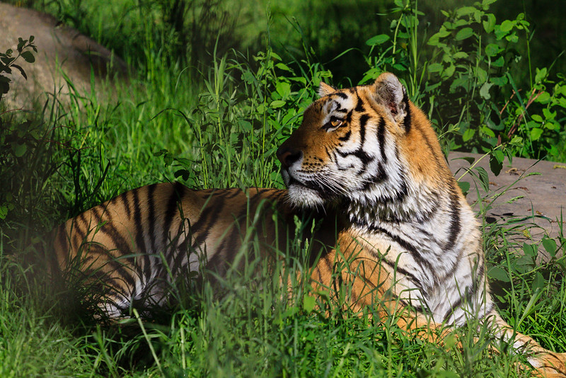
Just Stopping to Take a Quick Break by Joynt Inspirations, on Flickr


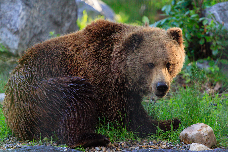
Ursus Arctos Horribilis by Joynt Inspirations, on Flickr


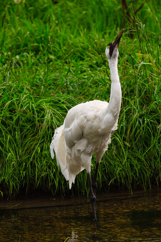
Whoop-Whoop-Whooping Crane by Joynt Inspirations, on Flickr


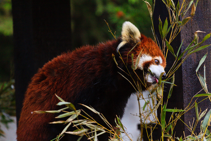
Fiery Flourish by Joynt Inspirations, on Flickr


Inveterate Apparitions by Joynt Inspirations, on Flickr
 
Thanks guys! :D

Film like eh, I do try and only edit them to a point where it matches what I see in my head. If that's film like, then that's a very cool description.

These are a few of my faves, and I usually try and post up a photo almost everyday. I'm fairly meticulous in my selection, although not everything is always as I hope it would be.

Anyone else have any feedback for me?
 
Upvote 0
Nice shots overall, Jay -- good stuff -- but it sounds like you want a little more hard critique to tease out potential improvements? My 2c:

- Peacock - Interesting crop, but not to my taste. Far left vegetation is distracting. Bird feels too tight to right. Personally I'd try a portrait crop closer to the head and sacrifice the (rather uninteresting, poor bird) body. Nice and sharp at screen res with good color though. This has most impact of the shots presented, especially if re-cropped.

- Tiger - Nice attempt but OOF cage/obstruction detracts. More problematic is the shadow over the nose. I would put this in my "try again" pile - reject for sharing except family. Good excuse to go back and shoot more!

- Bear - Pretty nice. Cage/obstruction again, but less problematic than for Tiger. Crop too tight on left, for me. Maybe at feet too.

- Crane - Doesn't "pop". Bird seems dull - some stronger white here might help. Pose is strange and doesn't really work for me. Crop puts bird awkwardly slightly off center but equally not far enough to the side - and the wrong side, if off-center intended - so it would look like the bird is walking into the shot rather than going out.

- Fireworks - Could pop a little more to be more compelling (sky doesn't seem true black), but very nicely done and quite balanced as-is.

- Mountains - Doesn't work for me. Mountains are all in shadow and ill-defined. Mirror effect is ok, but overall effect is too plain and not interesting. Sky seems over-processed compared to rest of scene - though saturation of trees is also strong, so maybe you just globally over-saturated. If you have Lightroom, clarity might help the mountains a bit, but it won't change simply the wrong time of day. Nice and sharp at screen res though!

- Red panda - like the bear, pretty nice overall. Not "strong", but fine.

Hopefully you'll find this constructive, as intended. Keep going! :)
 
Upvote 0
P

paul13walnut5

Guest
Great beginnings, I would take on board the previous critques, which I can only add a small amount to..

There is weird noise going on behind the bear, it's there in other shots, but most obvious in the bear shot.

I don't know your gear or settings, but I would strongly urge you shoot raw and play about with luminance noise reduction at the conversion stage (view at 100% or changes aren't always obvious) keep it subtle.

There is some tricky bokeh (the out of focus shapes behind the subject) I'm guessing this may be unavoidable if you are shooting through safety glass or wire etc.

Generally I think you need to tone down the saturation. It might be a colour space issue, these would probably make very vibrant prints, but when you are saving a version for web / vdu's use sRGB colour space, and adjust that file to suit. The saturation suits the landscape shot, it has a fuji 'velvia' feel, I don't think it suits the animal shots though, the green is too strident.

Finally, the landscape shot, nice composition and beautiful spot. I would download 'the photographers ephemeris' and try and get another take when the sun is more at right angles to the mountains. You'll still get great colour elsewhere, but you really bring out the relief of the terrain.

Great start. I look forward to seeing more of your work.
 
Upvote 0
Thanks for the feedback guys!

That odd noise is usually from using ISO 1,000 on my 50D. I find it distracting, and difficult to get rid of.

Paul, what conversion stage are you referring to? I shoot in RAW and try to reduce luminance noise in Lightroom 5. However it's a balance of trying to preserve the detail and colours, and eliminate some noise.

In the fireworks shot I initially tried to make the sky darker, but the smoke from all prior fireworks kept the sky hazy and more of a grey.

As for the saturation, I usually just edit them until it appeals to my eyes and how I remember the scene when I was there.

I've got many more shots to take and I'll let you guys see when they're ready!
 
Upvote 0