Selection help pls

Jan 22, 2012
4,796
1,578
40,538
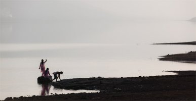
There is an art exhibition coming up where many top people from motion picture industry will come. I have a wall where I can exhibit my photos. The exhibitor wants me to eliminate one photo from the ones here. Which one should I remove.
Pls advice, I need it. Thx!!
 

Attachments

  • image.png
    image.png
    86.7 KB · Views: 517
  • photo 1.JPG
    photo 1.JPG
    78.2 KB · Views: 549
  • photo 2.JPG
    photo 2.JPG
    116.6 KB · Views: 561
  • photo 3.JPG
    photo 3.JPG
    59.3 KB · Views: 609
I do not like the criterion of choice for photo contests, so my opinion may be totally misplaced. But I think a big poster on the wall causes a very different visual impact of the computer screen. However, and I think the children's photo with the kitten is less "big eloquent."
 
Upvote 0
This sort of violates my rule of never asking for or giving advice on photos to anyone on this forum. I think crowd-sourcing of photo critiques is a good way to get to the lowest common denominator and kill true creativity.

That said, I love your work generally, so I can't help myself here.

The elephants and goats are definite keepers. The kids needs a caption. I'm guessing there is a story there, as the one boy appears to be smoking and that prompts me to wonder what is going on. Are they street children, orphans, child laborers...? Will the images be captioned? I hate to toss this one because it is the only shot were people are the subject. (People are in the other shots, but they are more objects than persons)

The man in shadow walking down the street is a nice study in design. The Zebras are as well. I guess I'd toss the man and the street first. Although if you think you have too many animal shots, then I'd drop the Zebras.
 
Upvote 0
I would remove the 1st one with the zebras, to me it is the least appealing one. I particularly like #2 and #3; to my eye these are the best ones. #5 has the same atmosphere and although it is no a 'landscape' but an 'urban' picture fits quite well in the set. #4 with the smoking boy fits less well with the rest. Topic-wise #1 fits well with 2 and 3, but the atmosphere is much different (although it may also be the small size of the posted picture that influences my feeling), mostly because it is after-dark.
 
Upvote 0