You are using an out of date browser. It may not display this or other websites correctly.
You should upgrade or use an alternative browser.
You should upgrade or use an alternative browser.
The Ship
- Thread starter JRS
- Start date


C
Canon-F1
Guest
Kernuak said:On the theme of less is more, I personally think the saturation has been pushed too far. Sunsets look nice when colourful, but the image should still look realistic in my opinion.
i agree that most edits are to much... like ken rockwell +50 saturation.
")
but freelancers and Z´s are in the ballpark.
i think it´s not to colourfull for print.
saturation will always be a bit reduced when printing.
and i have seen much more colourful sunsets in real.
what bothers me is the noise in k-amps and the other HDRish image.
the local contrast push is to much for my personal taste.
Upvote
0
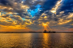
you flipped it. hmmm, maybe that's why dxo was refusing to straighten out the horizon for me. they all look pretty cool to me, just down to taste. now that i see the original though, i think you should have hit that ship with a 580 or a reflector for some fill ")
Upvote
0

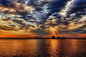
Classic example of why you need grad filters for landscapes. At a guess, a 3 stop grad on the sky and maybe a 1 stop on the sea would have helped with the light around the ship. Overall, the image is underexposed by around a stop, so with the grads 4 stop extra light would have helped lift the photo, with less need for over the top processing. If you have Lightroom, a slight increase in the highlight saturation only, would have prevented the weird colours in the blue sky.JRS said:Thanks all, this is the original:

Upvote
0
Well, here goes my take on this shot:
- I like the light rays on the ship but like the little boat on the left, too (which took me a short while to notice). I think cropping so that it looks like a panorama emphasizes that relationship between the two ships (tiny vs huge) and maybe how unfair life is (the sun shining only on the already privileged), and makes it easier to notice the little one;
- One other reason to crop is that the blue part of the sky kept drawing my eyes to it, as Freelancer said, so I got rid of it;
- I agree with Z on the green/magenta balance;
- I tried to overexpose the ship a bit, even though it's a JPEG and detail is not expected to come up by doing so.
Have I gone too far?
Attachments
Upvote
0
Kernuak said:Classic example of why you need grad filters for landscapes. At a guess, a 3 stop grad on the sky and maybe a 1 stop on the sea would have helped with the light around the ship. Overall, the image is underexposed by around a stop, so with the grads 4 stop extra light would have helped lift the photo, with less need for over the top processing. If you have Lightroom, a slight increase in the highlight saturation only, would have prevented the weird colours in the blue sky.
Can't I get the same effect of grad filters using HDR?
Upvote
0
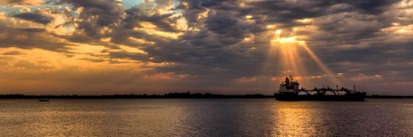
DanielW said:Well, here goes my take on this shot:
- I like the light rays on the ship but like the little boat on the left, too (which took me a short while to notice). I think cropping so that it looks like a panorama emphasizes that relationship between the two ships (tiny vs huge) and maybe how unfair life is (the sun shining only on the already privileged), and makes it easier to notice the little one;
- One other reason to crop is that the blue part of the sky kept drawing my eyes to it, as Freelancer said, so I got rid of it;
- I agree with Z on the green/magenta balance;
- I tried to overexpose the ship a bit, even though it's a JPEG and detail is not expected to come up by doing so.
Have I gone too far?
Like your crop!
Upvote
0
Nope, totally different look.JRS said:Kernuak said:Classic example of why you need grad filters for landscapes. At a guess, a 3 stop grad on the sky and maybe a 1 stop on the sea would have helped with the light around the ship. Overall, the image is underexposed by around a stop, so with the grads 4 stop extra light would have helped lift the photo, with less need for over the top processing. If you have Lightroom, a slight increase in the highlight saturation only, would have prevented the weird colours in the blue sky.
Can't I get the same effect of grad filters using HDR?
Upvote
0
Similar threads
- Replies
- 23
- Views
- 2K
D