art_d said:
First you say that good light needs no modification. Then you say good light can indeed result from modification. This seems to be a contradiction.
If you're modifying the light itself, the light after modification -- if you've done your job right -- is now good light.
But if you're doing your modifications to the art, the light is still bad. That could be an artist painting a high-contrast scene as a low-contrast scene, or a photographer digitally (or in the darkroom or whatever) reducing contrast, or whatever.
First, a digression. I'm attaching three pictures to this post. The first two are the digression; the third I'll discuss later.
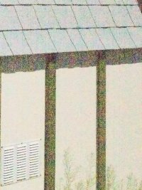
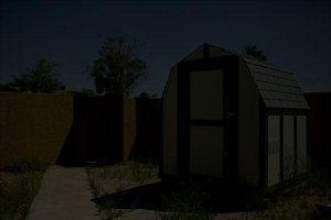
The first attachment is perhaps the archetypal cheesy Internet dynamic range test -- shooting into a garden shed on a bright day. I used a 5DIII and a Shorty McForty. 1/250 @ f/8 @ ISO 100 -- less than a stop dimmer than Sunny f/16.
You'll notice that the inside of the shed is very dark. And, indeed, it's basically exactly as dark as it appeared from my position. That's because this is a colorimetric rendering of the scene...which is different from the way most RAW developers tend to render scenes.
You see, film has a characteristic S-shaped curve to it -- a curve that's not natively present in RAW digital exposures but that almost every RAW developer since the dawn of time has intentionally and painstakingly mimicked. That is, film always stretches the contrast in the midtones but compresses the contrast in the shadows and the highlights. That's just the chemistry and physics of how film works.
Photographers have generally liked that rendition, because it creates images with more "pop." But they've also, perhaps unknowingly, fought against it, because it's exactly that S-shaped curve that causes loss of shadow and highlight detail both. There's no such thing as a free lunch, after all; if you increase contrast in one part of the image, it can only come at the expense of contrast in some other part of the image. Since it's generally the midtones that most people care about and don't mind a loss of detail in shadows and / or highlights, the default S-curve is often a good thing. But it's a real bitch to recover that shadow and highlight detail, especially after the S-curve has been applied, and doubly especially if you don't know that it exists. It can only be done by reducing the contrast in the midtones -- or, of course, by treating different parts of the image differently...and then you're left with an even bigger mess with the transition areas between those parts of the image. Adobe has worked some true magic with their RAW processors, but it's all done by hiding a lot of stuff under the rug. (Did I mention that there's no such thing as a free lunch?)
Anyway, with this colorimetric rendition of the shed, you can just barely pick out some texture in the interior, enough to guess at what's in there. And, from where I was standing, that's exactly what I was able to do: see just enough texture to guess at what I was seeing.
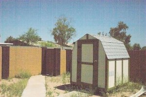
That brings us to the second picture. It's a 100% crop of the exact same RAW file, still a colorimetric rendition, but with four stops of digital push applied. And, surprise surprise! You can now easily see what those contents are -- just as if you were standing inside the shed itself. But, of course, the exterior is now vastly overblown.
I'll also note that I've here taken a four-stops-underexposed image and digitally pushed it. And not applied any noise reduction at all. If you've got any experience with these sorts of things, you should know that the noise that's there would clean up very easily and very well. Even if you didn't do anything to it, it wouldn't even be visible at anything less than a 12" x 18" print -- and even then, you'd have to look closely to see it and it wouldn't at all be objectionable.
Holy Cow! A Nikonista might exclaim. I must have used a D800! So little noise in shadows pushed four stops to a normalized exposure! No...I just exposed properly
and I started with a colorimetric rendition.
That's where a lot of these problems come from. Photographers start doing whatever they do with the S-curve already applied, and the contrast in the shadows already flattened into mud. The detail
was there...you're just trying to recover it after it's already been thrown away.
Enough of the diversion. Back to light.
There are, of course, times -- lots of times -- where you have no choice in the matter of the light. Sometimes, even, the extreme contrast is the whole point of the exercise and you've got no choice but to bracket and combine exposures to capture everything. I have an example of that here:
http://www.canonrumors.com/forum/index.php?topic=12617.0
That's as extreme an example as I can possibly imagine: a single image that includes the disk of the new moon silhouetting the Sun itself, plus a fully-lit (and backlit) near foreground of the Grand Canyon, plus the deep shadows at the bottom of the Canyon. And it's a fair representation of the scene as I perceived it -- but not in a single glance! The Sun looks very much as it did when I looked at it through solar viewing glasses, and the rest looks very much as it did without the glasses. (With the glasses, of course, everything but the Sun was black.) The foreground was very contrasty and a bit too bright to look at, and it was very hard to pick detail out of the Canyon. And the layers of the Canyon very definitely did fade into intolerably bright glare in the distance, becoming practically indistinguishable at the horizon.
I'd call that bad light, but it was such a spectacle as I'll never forget -- and that rendering of the scene is very faithful to what I remember, even though I had to blend together a half-dozen exposures in order to create it. But, again, it includes detail all the way from the deep shadows of the Grand Canyon to the very Sun itself.
Here's another example of bad light, one that I've repeatedly discussed in this thread and therefore won't keep beating up on:
http://www.canonrumors.com/forum/index.php?topic=13771.msg249243#msg249243
I mainly mention that bad light in order to segue into what good light actually is and what it looks like.
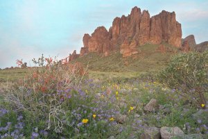
Here's what I actually went to the Lost Dutchman State Park on the day when I made that fisheye shot above -- the third attached photo.
With one minor and one insignificant caveat, this is, once again, a colorimetric rendering of the scene. As in, this looks almost exactly like what I saw, and it's almost exactly what the camera recorded. Again, the 5DIII, this time with the TS-E 24 II...and 1/6s @ f/16 * ISO 1600. Just a smidgen of chroma noise reduction and my typical capture and output sharpening.
The insignificant caveat is that the yellow of the the poppies is actually outside of the Lab gamut -- let alone Adobe RGB or even Pro Photo -- so that yellow got compressed / clipped to the perimeter of the Beta RGB gamut and then perceptually mapped into sRGB.
The minor caveat is that I had to darken the sky by about a stop to bring back the color and texture of the sky.
Perfect light would have resulted in a straight-out-of-the-camera colorimetric rendition that didn't need to be touched. This was as close to perfect as you're going to get in landscape photography.
It still took me a fair bit of fiddling with the sky to bring back the detail. Not because it was clipped in the raw exposure; I still had about a stop of headroom there. But the sky was a bit brighter than the foreground; the two never did quite perfectly equalize. I used a variety of methods to get this end result, but it's equivalent to about one stop of underexposure -- certainly less than two stops.
You can see a hint of haloing around the horizon, especially if you know it's there and you take a step back / reduce the image size. That is, the sky near the ground is a touch lighter than the sky a bit higher, and the tops of the ground are a bit darker than the ground below the horizon. That is an example of the lack of free lunches in action.
However, i like to think that I did a good job on this one. I don't think the transition is very noticeable, and it's certainly a lot less noticeable than if I had used a graduated filter (or waved a lens cap in front of the top half of the lens or whatever).
This is what good light looks like. Again, perfect light would have been with the sky about a stop darker and / or the foreground with about a stop brighter, but there wasn't any color left in the clouds when the light did equalize a few minutes later.
This post is already way too long, so I'll just end it here. Hope it helps.
Cheers,
b&
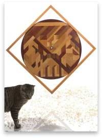
P.S. I lied. I can attach a fourth picture, so I will. It's perfect light, in a studio (with flash). This is a straight-out-of-the-camera colorimetric rendering, and absolutely zero post-processing. The feline photobomb was a fortuitous incursion that helps indicate scale...he's not perfectly lit, of course, but I like the way it makes him look like he's sneaking in from the wings of the stage. b&


")