Portraits C&C

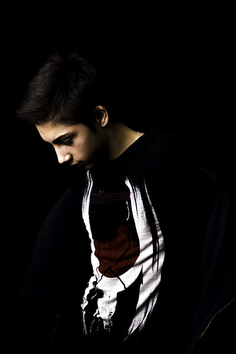
Probably as much a personal thing than anything else, but I feel that #1 lacks a little balance, and would prefer the right to be cropped to remove some of the black, as the model's top shows little separation from the background and would like to see more room on the left around his head to offer a more pleasing composition. That said, it's nice to see experimentation with something different.
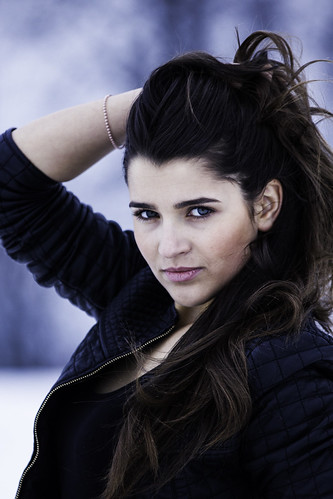
#2, the model looks uncomfortable and the image doesn't get her personality across. Compositionally though, it is possibly the weakest, as the cutting off of her elbow looks awkward.
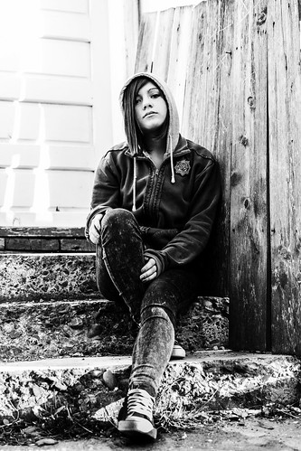
For me, #3 is by far the strongest image, as it portrays a story and really connects with the model.
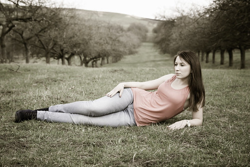
In #4, the model looks disinterested. It's always a risk when the model isn't looking at the camera, it can work, but it is harder to get it right.
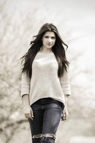
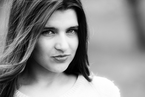
#5 is a fairly standard pose. Lighting is a little harsh, but handled well. Some engagement with the model, but not quite there. I quite like #6, not sure exactly why, but the cropping works well and the black and white simplifies things down to the model and her interaction with the camera.
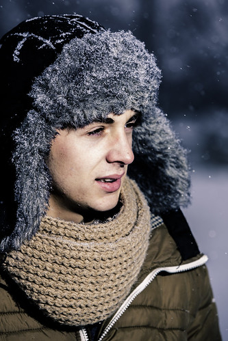
There isn't anything particularly wrong with #7, although the lighting isn't the best, but it doesn't do much for me. Again, it's difficult to get an image to work when the model isn't looking at the camera.
 
Upvote 0
It's sometimes more useful to be self-critical, as you know what you were aiming for and whether or not you achieved it. It's often more about developing a personal style. If you're not careful, you can listen too much to others and lose sight of what you are looking for as an artist in your own right. By all means listen, but don't necesaarily take heed of others' opinions; pick and choose what advice you follow.
 
Upvote 0
On 1 i aimed for low key and yes it needs some white balance work.
2 I'm aware that is too close but didn't had your thoughts, also i can't see that is uncomfortable maybe i miss something
4 i have some that it looks in the camera but for me this one works way more better. I wanted to be a wonder but i guess didn't do it that good.
7 i used a flash, i should it lower the power a little?
 
Upvote 0
Universeal said:
On 1 i aimed for low key and yes it needs some white balance work.
2 I'm aware that is too close but didn't had your thoughts, also i can't see that is uncomfortable maybe i miss something
4 i have some that it looks in the camera but for me this one works way more better. I wanted to be a wonder but i guess didn't do it that good.
7 i used a flash, i should it lower the power a little?

For #1, the low key look wasn't what I was commenting on, like it or not, that is a personal taste. however, I felt compositionally, it lacked balance, with negative space behind the model and less space in front. It's down to convention to some degree, but unless you try something different, then you won't develop your own style. Not everything will work and it won't be to everyone's taste, but it's good to try these things.
#2 - the model looks uncomfortable and self-conscious, but my thought on the composition was the cropping of her elbow. Generally, it's best to avoid chopping off body parts, such as parts of hands and the ends of arms (the elbows in this case).
 
Upvote 0
1. Don't really like the pose...lighting would work, but with him looking down and seemingly hunched over, his face is distorted (big cheeks, small chin). Possibly all resolved by moving his head up or the lighting on axis with his head.

2. Bad crop, otherwise I like...good lighting...good post colorization. They eyes might be a tad too intense to remain natural.

3. I quite like, but the perspective bothers me a little. Her feet are too big and head too small. Keep the same basic framing and move the camera up eye level and that will be solved.

4. Love the color and composition, but the pose is incredibly forced...no one voluntarily sits like that. A more natural pose would give the picture some life or the model a believable mood.

5. Perfect processing, but same thing here with the perspective. It looks like she's leaning back as she walks and her thighs are bigger looking than they should be.

6. Pretty perfect as is...I would move the crop up a little to get a little more hair in and a little less neck/sweater.

7. Pose is okay for me...would be better if he were smiling. The lighting makes this a miss though. It's too bright (might be correctable in post), but the more problematic part is the angle. It looks like you're shooting across his face and as a result, there's a very sharp shadow under his nose...kind of looks like a mini Hitler stache...def not a good look. If you moved the light in front of his face and about the same angle, you be broad lighting and the shadows would look more natural or at least what one would expect from natural sunlight. I would lower the magenta, too...his lips are way too pink...a warmer tone would mimic the setting sun, too.
 
Upvote 0