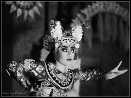
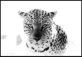
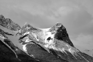
I am far away from being an expert on processing, so I have to rely on my ability to expose properly. In post processing of B&W images, I primarily play with contrast, clarity and the black and white sliders. On B&W images, you can go a lot further with those 4 than you can with colour. Occasionally I also adjust the colour sliders, if that is required to separate positive and negative space, or create pop.zim said:dEldar said:He he, Edward ... 69 is not THAT old
Early this year I went to Lake Kerkini in northern Greece, where the fantastic dalmatian pelican stays over the winter. This one, looking into the sunset, looks like a bird´s version of Lord Nelson.
beautiful image
I'm in admiration of the tonal ranges in these images. is that down to great processing skill and/or really good exposure? I love b&w but mine always look flat to me even after spending an age on curves and black point adjustments.
")
Very important though, is to use a good and calibrated monitor. I use an Eizo with built in hardware calibration. What I see on the screen is what comes out on my printer.
Attachments
Upvote
0
")