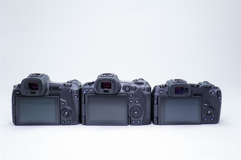
Side by side comparison of the Canon EOS R5, Canon EOS R and Canon EOS RP

joestopper

Rrr...
Feb 4, 2020
233
212
The EOS-1's (N, V, DsI DsII DsIII) have been my favorite cameras to hold. The R is too small for comfort, OR a sure and steady grip for me. Although I like the portability aspect, I think I can get that via the smaller lenses and shorter film-flange distance. I don't care if the camera's taller.

Here's a question: has anyone speculated on whether the R5--sort of a 5-series, is going to be the top end? Or is anyone noticing holes in the specs suggesting a higher-end camera would be forthcoming? What I'm waiting for is a sensor with new abilities: extended dynamic range, electronic ND, no rolling shutter, etc.

If yiu consider higher resolution higher end, then, yes, there will be one with far more than the 45mp of the R5 (the 5DSr had 50 already years ago).
 
Upvote 0

slclick

EOS 3
Dec 17, 2013
4,634
3,040
Your measurements highlight an interesting fact that the "unused?" border at the bottom of the R5 is *twice* as wide as it's other borders. But I also noticed that the right border of the R is also twice as wide as it's other borders. So it looks like the R active screen is offset to the left, while the R5 one is offset to the top. Why would they do this?
Could it be a line of setting info? Perhaps customizable? dunno
 
  • Like
Reactions: 1 user
Upvote 0
Your measurements highlight an interesting fact that the "unused?" border at the bottom of the R5 is *twice* as wide as it's other borders. But I also noticed that the right border of the R is also twice as wide as it's other borders. So it looks like the R active screen is offset to the left, while the R5 one is offset to the top. Why would they do this?

Probably need somewhere to put the electronics for the screen.

On the R is on the right which is probably not the best for the touch AF selection as you have to reach further across. Bottom or left look like the bet and was probably based on user feedback.
 
  • Like
Reactions: 2 users
Upvote 0

usern4cr

R5
CR Pro
Sep 2, 2018
1,376
2,308
Kentucky, USA
Probably need somewhere to put the electronics for the screen.

On the R is on the right which is probably not the best for the touch AF selection as you have to reach further across. Bottom or left look like the bet and was probably based on user feedback.
If you notice in the photo shown below, there is a double wide border on the right in one, on the bottom in another, and on the left in the other. I looked at my camera which has the same style screen, and it has the same to the right and there is no extra info or anything displayed in that area - it's just blank. So I guess it's just the way it is for the screen that was manufactured and supplied to them.

canon
 
Upvote 0

slclick

EOS 3
Dec 17, 2013
4,634
3,040
If you notice in the photo shown below, there is a double wide border on the right in one, on the bottom in another, and on the left in the other. I looked at my camera which has the same style screen, and it has the same to the right and there is no extra info or anything displayed in that area - it's just blank. So I guess it's just the way it is for the screen that was manufactured and supplied to them.

canon
"Oh look, the new batch of lcd's arrived...hmmm, now they put the bar at the bottom, oh well"

No. Canon isn't the sort of company to lay down and just take it in the rear (of the camera) It's their design, must be a reason.
 
  • Like
Reactions: 1 user
Upvote 0
Mar 17, 2020
440
325
"Oh look, the new batch of lcd's arrived...hmmm, now they put the bar at the bottom, oh well"

No. Canon isn't the sort of company to lay down and just take it in the rear (of the camera) It's their design, must be a reason.
Thinking more about this the one explanation could be to allow users to have better access for using "thumb" AF on the touch screen. If Canon research shows that it means having to "lift" the screen relative to the R that would explain having a larger screen with the touch towards the top of the camera as Canon would not want to recess the flip screen at the bottom.

At least this would make sense.
 
  • Like
Reactions: 1 user
Upvote 0

rom

EOS R
Feb 2, 2018
12
24
Denmark
Your measurements highlight an interesting fact that the "unused?" border at the bottom of the R5 is *twice* as wide as it's other borders. But I also noticed that the right border of the R is also twice as wide as it's other borders. So it looks like the R active screen is offset to the left, while the R5 one is offset to the top. Why would they do this?
You get more space for the control wheel
 
Upvote 0
I think the R5 and R6 should be the same size and build, let the RP be its own thing. Just make one with a cheeper sensor like Nikon did with the Z6 and Z7(though that may have backfired as the Z6 seems to be far more popular).

Meh, it's a completely different camera. The Z6 and Z7 are more similar to each other than the R5 and R6. I wouldn't be surprised if Canon goes with different builds for each. Indeed, it has been speculated that they'll use different build materials.
 
Upvote 0
Nov 2, 2016
849
648
I am completely against these rinky dinky cameras, not sure what appeals to you, are you hands small? A camera should fit well in your hands, the 5dIV fits perfectly, the Sony, Fuji cameras are too small, feel weird in the hands. I really hope Canon keeps their dslr ergonomics, I would be a shame to lose that. The R is small enough that its pushing the boundaries of feeling right in the hand. I'd prefer they don't break a winning design like the 5Div ergonomics.

The “are your hands small” comment isn’t necessary. Not everyone likes larger cameras. Way back, my Kodak tech rep had a Olympus Pen F. He was 6 foot three, and had large hands. He just liked a small camera.
 
  • Like
Reactions: 1 user
Upvote 0

slclick

EOS 3
Dec 17, 2013
4,634
3,040
Us larger handed North American male mammals can do fine with smaller camera bodies IF the controls are not cramped. My time with a Pen F and the M5 were both no longer than a year each with lots or 'trying' to use them. Cramped controls can be avoided if you accept and implement the correct software. Leica shows us a small body with sparse controls can offer a pleasant user interface. However people like buttons and switches. Going into menus drives some folks crazy and multipurpose D pads and buttons are not the most intuitive. It's a toss up.

It looks like the R5 is a nice sweet spot.
 
  • Like
Reactions: 3 users
Upvote 0
Curious about two things on the R5

What is what looks like a covered port on the front to the side of the lens?
Wired remote control port
What is between the back LCD screen and the < image review button near the bottom?
Nothing. Just an indentation in the body that lets you pull the screen out.
EDIT: answer below seems to be plausible
 
Last edited:
  • Like
Reactions: 1 user
Upvote 0

H. Jones

Photojournalist
Aug 1, 2014
803
1,637
Curious about two things on the R5

What is what looks like a covered port on the front to the side of the lens?

What is between the back LCD screen and the < image review button near the bottom?
That's the microphone for the voice memo feature, like on the 1D series. Very happy to have that feature included.
 
  • Like
Reactions: 1 users
Upvote 0