Canon Rumors site update

  • Like
Reactions: 1 user
Upvote 0
We're dealing with a intermittent issue of articles getting a 404 error. The short term "fix" is simple, but it will happen again. This seems to be fairly common for Wordpress migrations, if it happens please let me know. I believe it's a server-side issue and we have an active ticket open to troubleshoot the problem.
 
Upvote 0
You'll need to push the "Forum list" button to get the old sorting again.

View attachment 206284
Can you confirm what I am seeing please.

When you have a notification number bubble beside the "forum list" menu item, if you click through to see the forum list, none of the boards are bold showing where the unread notifications are from? I'd like to make sure this is a bug and not just something on my end.
 
Upvote 0
Can you confirm what I am seeing please.

When you have a notification number bubble beside the "forum list" menu item, if you click through to see the forum list, none of the boards are bold showing where the unread notifications are from? I'd like to make sure this is a bug and not just something on my end.
Not 100% sure what you mean. But suppose, yes.

Here is an overview, where I see a bubble:
Forum_overview.png


When I then go to the forum list, I see nothing bold, only "New" marks. Nothing in bold.
Forum_List.png
 
Upvote 0
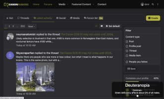
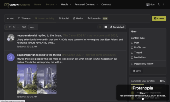
I give a lecture on Accessibility in my Software Engineering course each semester and at a recent faculty retreat since I have to rework the course materials for every new course I teach. I am a colorblind photographer (protanopia or red deficient). I didn't find out until I failed the flight physical for the USAFA. There were indications that became more apparent at that point. I see some red, but have trouble distinguishing yellow/green, blue/purple, and cyan/white.

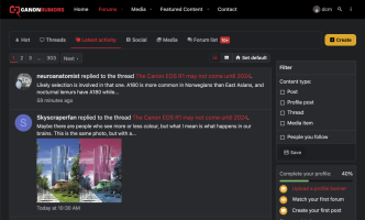
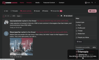
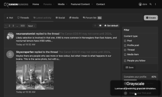
Computer displays can cause trouble, particularly with dark mode. When students come to me for help with a dark mode screen, I tell them they can close their laptop. After my lecture, they understand why. I made some suggestions to correct the colors on the last revision of CR so I could use dark mode, looks like I'll need to go back to light mode for now. Here are some views of the new CR site adjusted for different types of color blindness. Red text and highlights on a dark background are particularly bad for me as you will see. The percentages are for the US population, where about 8% of the population is color blind, mostly males.

Screen Shot 2022-11-12 at 11.32.29 AM.pngScreen Shot 2022-11-12 at 11.33.49 AM.pngScreen Shot 2022-11-12 at 11.33.37 AM.pngScreen Shot 2022-11-12 at 11.34.04 AM.pngScreen Shot 2022-11-12 at 11.34.26 AM.png
 
Last edited:
  • Like
Reactions: 1 user
Upvote 0
In the developer options of Android there is the option to simulate colour blindness. I have set my screen to grayscale 99% of the time unless I really need colour. The advantage of a grayscale screen on your phone in that it becomes slightly less addictive. On my Desktop I still enabled colour though, because I do all the photo editing there.

It would be cool to see "white pixels" without any colour filter on it on the R1. That could improve dynamic range. Not sure if the technology is ready yet. It may have some downsides, because otherwise it would already be used.
 
Upvote 0
I give a lecture on Accessibility in my Software Engineering course each semester and at a recent faculty retreat since I have to rework the course materials for every new course I teach. I am a colorblind photographer (protanopia or red deficient). I didn't find out until I failed the flight physical for the USAFA. There were indications that became more apparent at that point. I see some red, but have trouble distinguishing yellow/green, blue/purple, and cyan/white.

Computer displays can cause trouble, particularly with dark mode. When students come to me for help with a dark mode screen, I tell them they can close their laptop. After my lecture, they understand why. I made some suggestions to correct the colors on the last revision of CR so I could use dark mode, looks like I'll need to go back to light mode for now. Here are some views of the new CR site adjusted for different types of color blindness. Red text and highlights on a dark background are particularly bad for me as you will see. The percentages are for the US population, where about 8% of the population is color blind, mostly males.

View attachment 206318View attachment 206314View attachment 206315View attachment 206316View attachment 206317
I have added the accessibility options to the forum, previously I just had them on the blog.

You will see this button at the bottom left on desktop (It's currently off for mobile).
accessibebutton.jpg

Dark Mode and Light mode are set to "Autodetect" on the site. You can select which mode that you want at the bottom left by clicking the toggle or selecting the theme.
modechange.jpg

The Dark Mode will get an edit for the forum, the red on grey is bad.
 
Last edited:
  • Like
Reactions: 1 user
Upvote 0
Not sure I see the point of today's update? Seems the home page now only fills a central band of my screen whereas it used to fill the whole width of the monitor. New layout seems confusing too but i guess I may get used to it. The phrase 'If it ain't broke, don't fix it' springs to mind ...
Well, it was broken.
 
Upvote 0
I have added the accessibility options to the forum, previously I just had them on the blog.

You will see this button at the bottom left on desktop (It's currently off for mobile).
View attachment 206319

Dark Mode and Light mode are set to "Autodetect" on the site. You can select which mode that you want at the bottom left by clicking the toggle or selecting the theme.
View attachment 206320

The Dark Mode will get an edit for the forum, the red on grey is bad.
Thanks for working on this. There are many tools I cannot use in dark mode, even with their so-called color blind safe themes. Some tools allow me to make a custom theme, but those are rare.

You can use this tool to verify color contast. https://webaim.org/resources/contrastchecker/

The current contrasts are 2.85 and 2.7 for the red on the two shades of grey, well below the 7 required by WCAG 2.1 (Web Content Accessability Guidelines).

Some of the filter/forum name backgrounds could use some attention. Cinema has a contrast of 1.84. I usually aim for the 9-11 range. That gives the best chance of having good contrast with black text or white text.
 
  • Like
Reactions: 1 user
Upvote 0
Thanks for working on this. There are many tools I cannot use in dark mode, even with their so-called color blind safe themes. Some tools allow me to make a custom theme, but those are rare.

You can use this tool to verify color contast. https://webaim.org/resources/contrastchecker/

The current contrasts are 2.85 and 2.7 for the red on the two shades of grey, well below the 7 required by WCAG 2.1 (Web Content Accessability Guidelines).

Some of the filter/forum name backgrounds could use some attention. Cinema has a contrast of 1.84. I usually aim for the 9-11 range. That gives the best chance of having good contrast with black text or white text.
The red will be gone today. We'll be moving to a similar yellow as the previous site. Thank you for the lesson and the tool. I really appreciate it.
 
Upvote 0
The red will be gone today. We'll be moving to a similar yellow as the previous site. Thank you for the lesson and the tool. I really appreciate it.
If you could fix it in light mode as well, that would be great. The Top bar is dark mode, even when in light mode (at least int he autodetect).

1669236356637.png

The down-triangles are really hard for me to see (but I fail all of the Ishihari test plates, so...). The "high saturation" toggle that gave it a helpfull boost of contrast between the red and the black background, but then the logo looks worse :(

1669236603375.png
 
Upvote 0
If you could fix it in light mode as well, that would be great. The Top bar is dark mode, even when in light mode (at least int he autodetect).

View attachment 206508

The down-triangles are really hard for me to see (but I fail all of the Ishihari test plates, so...). The "high saturation" toggle that gave it a helpfull boost of contrast between the red and the black background, but then the logo looks worse :(

View attachment 206509
Sure. We're addressing some backend bugs next week, I'll add this to the list.
 
  • Like
Reactions: 1 user
Upvote 0