New Full Frame Camera in Testing? [CR1]

GMCPhotographics said:
Canon often do this kind of thing so that their products are fully tested by trusted professionals and they get the feed back their development engineers need. If they don't do this 1D4 fiascos are likely to occurr. While this kind of leak plays to our emotions, it is necessary for the developement of better camera models. But it is also kind of cool, becuase we get to hear very loose by telling information about prototypes which are currently in devleopment. We know (via other rumours) that Canon have a sensor patent / design which uses a different arrangement of the traditional bayer RGB array. It's likely that this new sensor is a test bed for that particular patent / technology and it appears to be an improvement over the current tech.
Bare in mind that the 5DIII resolves nearly as much detail as the D800. It's only the top end optical resolution of a few of the worlds sharpest lenses which can allow the D800 to out resolve the 5DIII and even then, there isn't much between them. Amusingly, Canon have more lenses in that bracket, than Nikon currently do...Canon's new 24-70IIL is the sharpest zoom lens so far from any brand. When Canon finally releases a camera body with this kind of MP count, there will be a lot of lenses to match the sensor's capabilies, where as Nikon have very few lenses which can match their current sensor tech. Most of their lenses do not optically resolve much over 22mp.
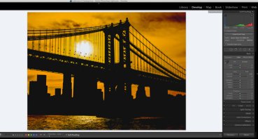
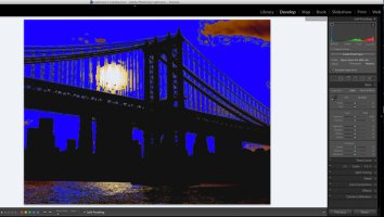
I think this new camera's sensor point to a more efficient use of the RGB array and probably the removal of the AA filter to create sharper and clearer details with the same resolution of 22mp. If this is the case, the new camera could easily match the D800's sharpness and detail but at a more effficient 22mp. the improvement in colour rendition sound good and i only hope that Canon have employed a simular supporting sensor design to achieve the same (if not better) shadow noise pushability in their raw files. This isn't an expanded DR as some have claimed, it's purely a better control of iso noise in the shadow areas of a raw file. Where as Canon files tend to break up and display banding with the same level of pushing in the shadows.
one could argue that the scene was incorrectly exposed in the first place...but the fact remains, Nikon / Sony currently have a 1.5 stop advantage in this single feature on their sensors. All the other features are a lot closer than the marketing / spin doctors would let you belive.


hi, i have owned a multiple every professional canon camera since the 1ds mk1, and at the moment i own 5dmk3's.
i brought a sony a7r to test a few weeks ago and was absolutely blown away by the detail and the latitude of the sony file. it clearly blows away the canon in detail with exactly the same lenses (i have been using the metabone adaptor I've shot exactly the same thing with two cameras and there just is no comparison.

i have no idea how you can say there are similar! have you got both cameras?

I was so impressed with the file from the sony- but very disappointed with the evf and usability of the sony. so i brought a d800 and lenses. the d800 appears virtually identical file wise to the sony, and i am very happy with it.

i am reluctantly holding on to my canon gear waiting for photokina. but canon has to improve their files with both megapixels and file depth, or i will be changing completely to nikon for the first time in 15years. the 5dmk3 files have disappointed me over and over again.
almost everyone i know who shoots in my field (advertising photography) have seriously considered or already moved to nikon.

paul
 
Upvote 0
Don Haines said:
LetTheRightLensIn said:
Don Haines said:
I find it inconceivable that there would not be a new FF camera in testing....

hopefully you do know what the word inconceivable means even if a certain someone in a certain movie did not
otherwise canon has lost the plot
not conceivable, unimaginable, incapable of being conceived, imagined, or considered....


I find it inconceivable that any thing(noun) or verb(action) could be correctly described as inconceivable, …it having been conceived already in order to be used as the subject of the description. ;D

Anything truly inconceivable will never be a subject of discussion!

Edit-(Maybe the world should be retired as unusable and something like "…difficult to believe." substituted? ) ???
 
Upvote 0
Larry said:
Don Haines said:
LetTheRightLensIn said:
Don Haines said:
I find it inconceivable that there would not be a new FF camera in testing....

hopefully you do know what the word inconceivable means even if a certain someone in a certain movie did not
otherwise canon has lost the plot
not conceivable, unimaginable, incapable of being conceived, imagined, or considered....


I find it inconceivable that any thing(noun) or verb(action) could be correctly described as inconceivable, …it having been conceived already in order to be used as the subject of the description. ;D

Anything truly inconceivable will never be a subject of discussion!
+√∞ :)
 
Upvote 0
I'm doubtless opening myself up to all sorts of disapproval here, but can someone explain/share links on the subject of colour accuracy? What does it mean - accurate in what sense? What are we calibrating the camera against?

I have never done studio work, so it's a bit beyond my world, but when I take photographs, I adjust the colour balance afterwards based on a couple of things - either I pick a spot that I know was close to neutral grey (if there is one), and/or adjust until the picture resembles what I remember seeing/believe is best. I'd batch process for groups of shots taken together.

I suppose it would be nice, to speed things up if I were processing lots of similar shots, to use an automated method, but am I missing something? My eyes each see the colour balance of the world slightly differently (when I close one then the other it can be quite obvious) - I imagine we all see colours slightly differently. And then there's how you're viewing the photos, and the ultimate intent of the image (the feel, for want of a better word).

I can understand accuracy in the sense of a device measuring the wavelengths of the light from each element in the scene, and recording them. And if it records different colours as the same (metamerism?) then this is bad. But the middle bit - translating measured light into an image we see and recognise and relate to... where does 'accuracy' fit in? If I see a picture of a flower, how do I know precisely what colour it was, if I wasn't there? Or what tint the lighting added, etc.

Sorry, sometimes fundamental concepts seem strange to me.
 
Upvote 0
When "they" are talking about colour accuracy like that they are not talking about white balance, well they shouldn't be, they are talking about the relationship of colours to each other. That is where the Camera Calibration profiles in LR, PS and DPP come in, is the Landscape or the Portrait option more realistic when both use the same WB?

The most anal people I know about image colour are flower photographers and ceramicists, ever photograph a red flower and it not look anything like the flower did? Try deep blue, purple, and mauve flowers, they are a very difficult to get accurate and you have to use a camera profile specifically for the light you shot in.

That is what they are talking about, specific camera profiles, or more probably an enhanced Bayer filter array and firmware that delivers more accurate colours in more lighting situations more often. Anything that saves processing time and is perceived as "better" will have a market in the studio environment.

This link gives a little background on that Camera Calibration panel. http://x-equals.com/blog/playing-with-color-camera-profiles/
 
Upvote 0
privatebydesign said:
The most anal people I know about image colour are flower photographers and ceramicists, ever photograph a red flower and it not look anything like the flower did? Try deep blue, purple, and mauve flowers, they are a very difficult to get accurate and you have to use a camera profile specifically for the light you shot in.

A lot of trouble with flowers is even more that people seem to stick to sRGB which makes many flowers impossible to show correctly. A wide gamut monitor will give you a much better chance (of course it's true that the WB and profiles and all can still mess with things).
 
Upvote 0
LetTheRightLensIn said:
privatebydesign said:
The most anal people I know about image colour are flower photographers and ceramicists, ever photograph a red flower and it not look anything like the flower did? Try deep blue, purple, and mauve flowers, they are a very difficult to get accurate and you have to use a camera profile specifically for the light you shot in.

A lot of trouble with flowers is even more that people seem to stick to sRGB which makes many flowers impossible to show correctly. A wide gamut monitor will give you a much better chance (of course it's true that the WB and profiles and all can still mess with things).

True, sRGB is too endemic. It's really time we started moving towards larger gamuts. Even AdobeRGB isn't quite good enough, as most of the gain with AdobeRGB is in the greens. The deep reds and blues and violets, where a lot of flower color resides, don't really change much with AdobeRGB. ProPhotoRGB may not be the best either, as its extent is even beyond that of human perception, but it's still got the ability to map almost every color at the richest saturation the human eye can discern.

Sadly, even 10-bit screens with 14- and 16-bit 3D LUTs are still not quite good enough at showing reds. I have these Peonies that are just about to burst into color. I've tried photographing them in years past, and I've never been able to get the reds and pinks to come out right...they clip and there is little tonality. Bleh. It's such a pain. My roses have a similar problem, however most of those have a deeper red that actually does fall into gamut for AdobeRGB.

No question, though...rich saturated color, particularly in the non-greens, can be a real problem.
 
Upvote 0
jrista said:
LetTheRightLensIn said:
privatebydesign said:
The most anal people I know about image colour are flower photographers and ceramicists, ever photograph a red flower and it not look anything like the flower did? Try deep blue, purple, and mauve flowers, they are a very difficult to get accurate and you have to use a camera profile specifically for the light you shot in.

A lot of trouble with flowers is even more that people seem to stick to sRGB which makes many flowers impossible to show correctly. A wide gamut monitor will give you a much better chance (of course it's true that the WB and profiles and all can still mess with things).

True, sRGB is too endemic. It's really time we started moving towards larger gamuts. Even AdobeRGB isn't quite good enough, as most of the gain with AdobeRGB is in the greens. The deep reds and blues and violets, where a lot of flower color resides, don't really change much with AdobeRGB. ProPhotoRGB may not be the best either, as its extent is even beyond that of human perception, but it's still got the ability to map almost every color at the richest saturation the human eye can discern.

Sadly, even 10-bit screens with 14- and 16-bit 3D LUTs are still not quite good enough at showing reds. I have these Peonies that are just about to burst into color. I've tried photographing them in years past, and I've never been able to get the reds and pinks to come out right...they clip and there is little tonality. Bleh. It's such a pain. My roses have a similar problem, however most of those have a deeper red that actually does fall into gamut for AdobeRGB.

No question, though...rich saturated color, particularly in the non-greens, can be a real problem.

I had the same problem when using colour slide and a back lit red tulip many years ago. I bracketed 5 stops either side and I was unable to record the details becuase the reds were over saturated. Interestingly, I found that colour print film had a wider dynamic range than slide or digital and yet it was seen as a less "professional" medium.
Hot reds are a common issue which are not just confined to Digital capture. It's an issue with all capture mediums.
 
Upvote 0
LetTheRightLensIn said:
privatebydesign said:
The most anal people I know about image colour are flower photographers and ceramicists, ever photograph a red flower and it not look anything like the flower did? Try deep blue, purple, and mauve flowers, they are a very difficult to get accurate and you have to use a camera profile specifically for the light you shot in.

A lot of trouble with flowers is even more that people seem to stick to sRGB which makes many flowers impossible to show correctly. A wide gamut monitor will give you a much better chance (of course it's true that the WB and profiles and all can still mess with things).

But with any gamut, you have to ultimately prepare the image for the end viewer who is likely using sRGB.
 
Upvote 0
jrista said:
LetTheRightLensIn said:
privatebydesign said:
The most anal people I know about image colour are flower photographers and ceramicists, ever photograph a red flower and it not look anything like the flower did? Try deep blue, purple, and mauve flowers, they are a very difficult to get accurate and you have to use a camera profile specifically for the light you shot in.

A lot of trouble with flowers is even more that people seem to stick to sRGB which makes many flowers impossible to show correctly. A wide gamut monitor will give you a much better chance (of course it's true that the WB and profiles and all can still mess with things).

True, sRGB is too endemic. It's really time we started moving towards larger gamuts. Even AdobeRGB isn't quite good enough, as most of the gain with AdobeRGB is in the greens. The deep reds and blues and violets, where a lot of flower color resides, don't really change much with AdobeRGB. ProPhotoRGB may not be the best either, as its extent is even beyond that of human perception, but it's still got the ability to map almost every color at the richest saturation the human eye can discern.

Sadly, even 10-bit screens with 14- and 16-bit 3D LUTs are still not quite good enough at showing reds. I have these Peonies that are just about to burst into color. I've tried photographing them in years past, and I've never been able to get the reds and pinks to come out right...they clip and there is little tonality. Bleh. It's such a pain. My roses have a similar problem, however most of those have a deeper red that actually does fall into gamut for AdobeRGB.

No question, though...rich saturated color, particularly in the non-greens, can be a real problem.

Just to confirm your experience, one or two lifetimes ago when Kodak existed I worked with one of their color film researchers. From time to time he would show up at my lab with test emulsions, photographing everything to be seen. He told me that deep blue, purple, and mauve were the most difficult colors to reproduce with any accuracy. Some sort of daylight metamerism was his explanation, though I forget the details.
 
Upvote 0
Oceo said:
jrista said:
LetTheRightLensIn said:
privatebydesign said:
The most anal people I know about image colour are flower photographers and ceramicists, ever photograph a red flower and it not look anything like the flower did? Try deep blue, purple, and mauve flowers, they are a very difficult to get accurate and you have to use a camera profile specifically for the light you shot in.

A lot of trouble with flowers is even more that people seem to stick to sRGB which makes many flowers impossible to show correctly. A wide gamut monitor will give you a much better chance (of course it's true that the WB and profiles and all can still mess with things).

True, sRGB is too endemic. It's really time we started moving towards larger gamuts. Even AdobeRGB isn't quite good enough, as most of the gain with AdobeRGB is in the greens. The deep reds and blues and violets, where a lot of flower color resides, don't really change much with AdobeRGB. ProPhotoRGB may not be the best either, as its extent is even beyond that of human perception, but it's still got the ability to map almost every color at the richest saturation the human eye can discern.

Sadly, even 10-bit screens with 14- and 16-bit 3D LUTs are still not quite good enough at showing reds. I have these Peonies that are just about to burst into color. I've tried photographing them in years past, and I've never been able to get the reds and pinks to come out right...they clip and there is little tonality. Bleh. It's such a pain. My roses have a similar problem, however most of those have a deeper red that actually does fall into gamut for AdobeRGB.

No question, though...rich saturated color, particularly in the non-greens, can be a real problem.

Just to confirm your experience, one or two lifetimes ago when Kodak existed I worked with one of their color film researchers. From time to time he would show up at my lab with test emulsions, photographing everything to be seen. He told me that deep blue, purple, and mauve were the most difficult colors to reproduce with any accuracy. Some sort of daylight metamerism was his explanation, though I forget the details.

I think it's difficult to reproduce blues, violets, and magentas because it's hard to reproduce blues richly in any medium. It is difficult to create dye or pigment layers in film that are richly saturated enough to support truly deep hues. It's difficult to get light-emitting substances, or filters with backlights, to support the kind of deep, richly saturated blue that would be necessary for the reproduction of deep blues and purples.

When it comes to print, lighting and metamerism are significant problems. I think it's possible to create the necessary dyes and pigments, but print dyes and pigments are entirely dependent upon reflecting light. When the incident light is heavily red-shifted most of the time (i.e. your average tungsten lighting in a home, or window-filtered daylight that includes very little UV light), it is very difficult to get those dyes or pigments to fluoresce in such a way that the deep purples and violets and magentas they may be capable of reproducing to actually be reproduced.

Blue is just a sucky color when it comes to color reproduction. I think it always has been, and I think it always will be. It's an inherently weak color, we are inherently less sensitive to it in the highest color-sensitive region of our eyes (the central 2° "foveal spot"), and for any reproduction mediums that rely on reflected light (i.e. print), we rarely illuminate with the necessary kind of light that helps to reproduce the bluer end of the spectrum.
 
Upvote 0
I wasn't talking about saturation levels, all gamuts including out eyes have their ceilings with regards saturation, I was talking actual accurate colour. Even if you can't contain a saturation level within a specific mediums gamut, either screen or print, you can get the colour right. The reproduction then becomes a choice of rendering intent, and for images with considerable out of gamut colours Perceptual Intent gives the most accurate rendition, the saturation level might not be accurate but the colours and their relationship to each other are.

To understand the limitations and capabilities of reproduction you have to understand the difference between colour and saturation. The same colour can have an infinite number of saturation levels.

Here is a problem image I printed for another photographers show recently, the first image is the actual image, the second has a gamut warning on, all the blue. That doesn't mean I can't print the correct colours, it just means I can't print the correct colours at the correct saturation levels. How I choose to move those unprintable saturation levels into the gamut I have is the skill of the thing, but getting the colours right is the basics for a printer.
 

Attachments

  • 22.jpg
    22.jpg
    96.8 KB · Views: 787
  • 21.jpg
    21.jpg
    109.5 KB · Views: 800
Upvote 0
privatebydesign said:
I wasn't talking about saturation levels, all gamuts including out eyes have their ceilings with regards saturation, I was talking actual accurate colour. Even if you can't contain a saturation level within a specific mediums gamut, either screen or print, you can get the colour right. The reproduction then becomes a choice of rendering intent, and for images with considerable out of gamut colours Perceptual Intent gives the most accurate rendition, the saturation level might not be accurate but the colours and their relationship to each other are.

To understand the limitations and capabilities of reproduction you have to understand the difference between colour and saturation. The same colour can have an infinite number of saturation levels.

I don't think you can really separate "color" and "saturation". "Color" is a three-dimensional factor...it isn't "color" and saturation. Color in terms of the aspects that define it is composed of hue, saturation, and intensity all together...I don't believe those are aspects that can be decoupled. Any given definable color must be defined with all three aspects of color. It is not possible to collapse hue and intensity into some arbitrary term "color", and then decouple saturation and say "I can now select accurate 'color' in every gamut". A deeply saturated red is not the same as a mildly saturated red, neither of which are the same as a weakly saturated red. I don't think you can have an accurate rose red if you aren't achieving the right level of saturation. You may be able to find an acceptable alternative for a real-world rose red...but that does not mean your color is accurate...it only means it is perceptually acceptable.

I think, based on the way you are using the word "color", you are really referring to hue. Yes, you can find the right hue within any gamut. Once you have the necessary hue, it is then a matter of achieving the right intensity level and saturation to make it completely accurate (relative to the real world...as that is the only true source of accuracy). When it comes to gamut, in full 3D, BOTH saturation and intensity can be limited. Only hue, which is a radial factor around the central "z" or intensity axis in 3D color models (i.e. around L* in Lab) can always be accurately selected in all gamuts. Sometimes you cannot achieve a true, pure black, and neither can you achieve the deepest intensities of color near black. Similarly sometimes, especially in print, you cannot achieve the brightest intensities near pure white. Colors that are out of gamut have to do with all three dimensions of color...not just one (i.e. saturation).

privatebydesign said:
Here is a problem image I printed for another photographers show recently, the first image is the actual image, the second has a gamut warning on, all the blue. That doesn't mean I can't print the correct colours, it just means I can't print the correct colours at the correct saturation levels. How I choose to move those unprintable saturation levels into the gamut I have is the skill of the thing, but getting the colours right is the basics for a printer.

It DOES mean you cannot print the correct colors, since color is a three dimensional factor. You may be able to achieve the correct hue, but your saturation and/or intensity will not be correct in print. You can find perceptually relevant alternatives, but the "colors" themselves are not accurate.
 
Upvote 0
It depends to some extent on semantics, and you have far more stamina than I for that.

My old teacher and Wikipedia both referred to Saturation as "the colourfulness of a colour relative to its own brightness". Possibly not the most technical description, but it gets the idea over to non technical folk.

The rest, we agree on, basically.

If you are going to represent something in a space smaller than it occupies in real life you have to do something, I am saying get the saturation levels relative to each other as close as possible (to fit in the smaller space), get the brightness as close as possible (to fit in the reproduction medium), but there is no excuse for not getting the hue correct. If you do that, even though it isn't "true to nature", it is an accurate rendition and will appear so to the eye.
 
Upvote 0