Off Lighting/Color With 7D

Status
Not open for further replies.
L

lady

Guest
Not sure if this is the right section for this. I need a critique.

I've taken some photos that I consider to be excellent and others that I just sit there wondering how I could have screwed up so bad. I'm not a professional, just someone who likes taking pictures of things, but I would like to be able to make each picture look crisp, clear, and rich in color. I shoot manual. I just don't know what I'm doing wrong here so I'm coming to you guys. I have a 50mm f/1.4 and the 17-40mm f/4L.

Almost all of my photos have the exif data available on flickr, I'm just posting some examples here.
http://www.flickr.com/photos/kreebby

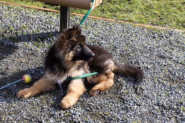
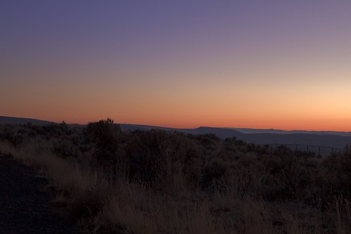
This one feels incredibly "dull" to me. I did very little post processing (changed the white balance) afterward and just uploaded it to deal with it. I can't figure out why it seems dull.
http://www.flickr.com/photos/kreebby/6883229995/#in/photostream/
6883229995_6ec3bf4399_z.jpg


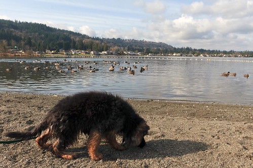
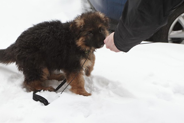
In this one I want his coat to pop out and be more defined, but he's almost invisible compared to the ducks in the background.
http://www.flickr.com/photos/kreebby/6883198981/#in/photostream/
6883198981_ff585c78d9.jpg


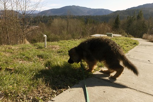
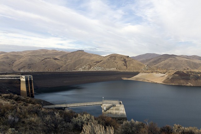
Again, really "dull".
http://www.flickr.com/photos/kreebby/6832025137/#in/photostream/
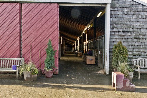
6832025137_48617140d6.jpg


Another dull one:
http://www.flickr.com/photos/kreebby/6854830319/#in/photostream
6854830319_6aa4c41a2b.jpg


Here are some examples of photos that turned out well for me:
6722039055_a6c5211774_z.jpg

6883194653_e8274855ab_z.jpg

6861641523_6188a975ac_z.jpg

6666421125_44844f38ee.jpg

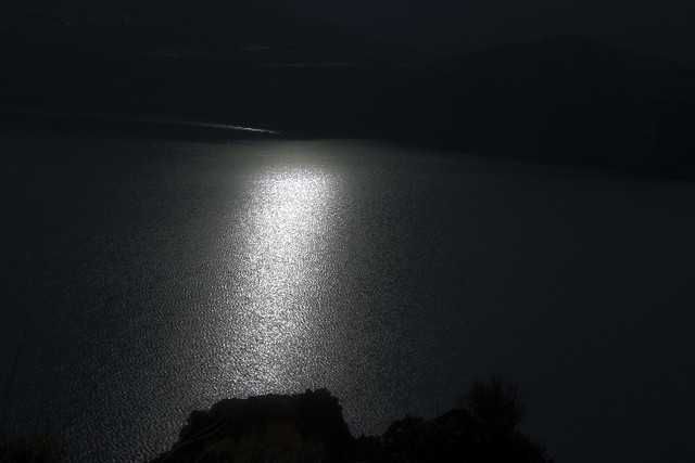
This one was shot in bright daylight, I changed the aperture and shutter speed to make it look like it was dark:
6666385377_4fe8073b3b_z.jpg

6586801247_a19c86d333_z.jpg

6586664589_cca408c31b.jpg


It seems like the biggest problem I have is shooting specific objects. I'm pretty decent at shooting scenes, but whenever I have a person or an animal that's supposed to be front and center I falter. Any tips for this?
 

Fleetie

Watching for pigs on the wing
Nov 22, 2010
375
5
52
Manchester, UK
www.facebook.com
Your pictures don't look bad at all to me! Even the "dull" ones.

A couple of ideas:

1) For SOME of the "dull" ones, you might have been better off opening up the aperture a bit to blur off the background, if you like that effect. (I do.)

2) I cheat with my 7D. I NEVER post-process at all, but I *do* shoot with the colour saturation increased by a couple of notches. It's probably "naughty" but I love bright colours and I prefer the results it gives.

Best of luck; I'm sure others will have better suggestions!
 
Upvote 0
Mar 25, 2011
16,847
1,835
I think that improvement suggestions would best be given for each image.

However, as a general comment, lighting is the issue in all of them, light objects and shadows require you to chose to expose for one or the other. Thats why you hear camera owners wishing for more "DR". DR (Dynamic Range) simply put, is what allows dark and bright objects to still retain detail in a image. If yoou have more DR, then you can have a good image with both very bright areas as well as shadows.

The second thing is when you have lots of white or gray in a image, it fools the camera as to what the true color is, and sometimes makes the image appear underexposed and dull.

Thirdly, a bright background will almost require some exposure compensation because the camera will reduce the exposure and make your subject too dark. Shoot with light from your back or at least from the side.

In the event that you have no choice of having a bright background. Then you need to manually increase the exposure so that the bright background is overexposed, but the subject is correctly exposed.

You can also shoot in RAW and use software like Lightroom or other excellent photographic editing software to lighten shadow areas and darken bright areas. This reduces contrast, but you can add clarity which increases contrast of the edges to make the subject pop out. All of these are basically adjustments to the lighting.
 
Upvote 0
Jul 21, 2010
31,228
13,088
Pay attention to the background. Look at the shots you think are flat - dark dog against gravel, sand, and grass, brown bottle against light brown countertop. Then look at the ones you like - dark dog against snow, white clouds against blue sky, etc. Contrast is the key, and the lack of contrast between subject and background results in a flat look, even if you push saturation (FWIW, I prefer to push vibrance, as I think it adds 'pop' without looking overdone).
 
Upvote 0
Adding to what Neuro had mention, it would be better if you could get down to the same level as the dog to take your shot. Those shot you have taken look flat to you because this is how we normally view dogs from a standing point, thus it becomes a common view. You might also try getting closer shot of the dog, using lower f value. By doing so, you can focus on the dog and blur out the background.
 
Upvote 0
L

lady

Guest
BlueMixWhite said:
Adding to what Neuro had mention, it would be better if you could get down to the same level as the dog to take your shot. Those shot you have taken look flat to you because this is how we normally view dogs from a standing point, thus it becomes a common view. You might also try getting closer shot of the dog, using lower f value. By doing so, you can focus on the dog and blur out the background.

I liked the shots where I could do that. Part of the problem was he kept running towards me when I kneeled down. Good suggestion. I might try getting a simple low-to-the-ground tripod so I can distract him myself and get the shot.

neuroanatomist said:
Pay attention to the background. Look at the shots you think are flat - dark dog against gravel, sand, and grass, brown bottle against light brown countertop. Then look at the ones you like - dark dog against snow, white clouds against blue sky, etc. Contrast is the key, and the lack of contrast between subject and background results in a flat look, even if you push saturation (FWIW, I prefer to push vibrance, as I think it adds 'pop' without looking overdone).

Ooh, that's a good suggestion. I'll start paying more attention to background now.

Mt Spokane Photography said:
I think that improvement suggestions would best be given for each image.

However, as a general comment, lighting is the issue in all of them, light objects and shadows require you to chose to expose for one or the other. Thats why you hear camera owners wishing for more "DR". DR (Dynamic Range) simply put, is what allows dark and bright objects to still retain detail in a image. If yoou have more DR, then you can have a good image with both very bright areas as well as shadows.

The second thing is when you have lots of white or gray in a image, it fools the camera as to what the true color is, and sometimes makes the image appear underexposed and dull.

Thirdly, a bright background will almost require some exposure compensation because the camera will reduce the exposure and make your subject too dark. Shoot with light from your back or at least from the side.

In the event that you have no choice of having a bright background. Then you need to manually increase the exposure so that the bright background is overexposed, but the subject is correctly exposed.

You can also shoot in RAW and use software like Lightroom or other excellent photographic editing software to lighten shadow areas and darken bright areas. This reduces contrast, but you can add clarity which increases contrast of the edges to make the subject pop out. All of these are basically adjustments to the lighting.

Hmm, interesting. Thanks. I always worry about the background being over-exposed. I'll practice tomorrow and see how things turn out. I have a copy of photoshop, I don't use lightroom (tried the trial) because it adds every little change you make to the exif data.


Fleetie said:
Your pictures don't look bad at all to me! Even the "dull" ones.

A couple of ideas:

1) For SOME of the "dull" ones, you might have been better off opening up the aperture a bit to blur off the background, if you like that effect. (I do.)

2) I cheat with my 7D. I NEVER post-process at all, but I *do* shoot with the colour saturation increased by a couple of notches. It's probably "naughty" but I love bright colours and I prefer the results it gives.

Best of luck; I'm sure others will have better suggestions!

That's a neat way of "cheating". I have issues with colors because I edit on really high quality, color accurate monitors (Macbook Pro and Dell UltraSharp). Everything looks perfect on them but when I go to look at the photos on normal monitors they look desaturated. I have to find a happy medium. Speaking of aperture, I've been considering selling my 17-40 and buying a 24-70 lens to get a wider aperture (and because it takes crisper images). Would you think this is a good idea too?
 
Upvote 0

dryanparker

Art photographer based in Miami.
Oct 9, 2011
121
0
44
Coconut Grove, FL
www.dryanparker.com
Fleetie said:
For SOME of the "dull" ones, you might have been better off opening up the aperture a bit to blur off the background, if you like that effect.

+1. A shallow depth of field helps separate your subject and adds focus and drama to your image.

neuroanatomist said:
Pay attention to the background. ... Contrast is the key, and the lack of contrast between subject and background results in a flat look, even if you push saturation.

Absolutely agree, Neuro. Composition and "seeing" a photo is a skill that takes time to hone. Composition is my favorite aspect of photography, as it allows you to be creative in revealing something extraordinary in an otherwise ordinary scene.

BlueMixWhite said:
Adding to what Neuro had mention, it would be better if you could get down to the same level as the dog to take your shot. Those shot you have taken look flat to you because this is how we normally view dogs from a standing point, thus it becomes a common view. You might also try getting closer shot of the dog, using lower f value. By doing so, you can focus on the dog and blur out the background.

+1. Well stated. In so many scenarios, I find a low angle a far more interesting perspective.
 
Upvote 0
I

iDee

Guest
Regarding the color issue... set the color space to Adobe RGB in camera, set Photoshop: Camera Raw to 16 bits with Adobe RGB selected. After processing convert the color profile to SRGB (EDIT > Convert to Profile > SRGB) and save for web delivery. Noticed your color space was not defined in the Exif data.

I shoot on a 7D with Zeiss ZF lenses and often bump saturation in Camera Raw. Check out my flickr.com/clayapples
 
Upvote 0
With pictures 1, 2, 3, and the last one, the subjects are light poorly. try shooting with your subject not backlight. Try shooting at either earlier or later in the day. Get the sun shining on your object; point your shadow at the subject to know if it is light well.

7 is a dull picture because there is no clear purpose to the image; when everything is on focus, nothing is in focus. You need the background to provide the eye a visual cue that there is depth to the scene. Use the 50 1.4 @ 1.4 as much as possible. It will help you develop this vision.

#8 isn't bad, but would be better if the foreground were either black or lighter.

#9 would be better with a better foreground.

#10 would be better if you had pointed the camera toward the ground a little more...

Hope this helps! What makes a good picture is not high saturation as much as it is subtle details as listed above; keep working at it! You are getting there!!!
 
Upvote 0
Jul 21, 2010
31,228
13,088
lady said:
I have issues with colors because I edit on really high quality, color accurate monitors (Macbook Pro and Dell UltraSharp). Everything looks perfect on them but when I go to look at the photos on normal monitors they look desaturated.

Have you calibrated your monitors with a spectrometer (Datacolor Spyder, X-Rite i1, etc.)? I ask because the standard MacBook Pro display profile (Color LCD) is very saturated and high-contrast, and the black-point is high (the bottom ~15 gray levels are indistinguishable, as are the top ~10). Apple makes consumer products, and 'typical' consumers like 'vibrant and punchy' displays, not accurate color I certainly wouldn't call the default MBP display 'color-accurate' - far from it! After calibrating my 17" MBP with an i1 Display 2, the saturation is less, the contrast lower, and I can distinguish all 256 gray levels.
 
Upvote 0
BlueMixWhite said:
Adding to what Neuro had mention, it would be better if you could get down to the same level as the dog to take your shot. Those shot you have taken look flat to you because this is how we normally view dogs from a standing point, thus it becomes a common view. You might also try getting closer shot of the dog, using lower f value. By doing so, you can focus on the dog and blur out the background.

+1. From a composition standpoint I say this point is key. Trying to get an angle that people don't normally see can make a photo more interesting. This point, coupled with what others have said about depth of field will help a lot.

The 50mm f1.4 lends it self perfectly to blurring the background out. And if you are at eye level with the dog shooting at f1.4 the background will probably be much farther away (like the trees in the distance) and melty smooth. If you are at standing the background will actually be the ground and much closer to the dog. It may only be slightly blurry.

Maybe try to take the same type of picture with the dog as you did with the bottle of brew.

Cheers! :)
 
Upvote 0
AprilForever said:
With pictures 1, 2, 3, and the last one, the subjects are light poorly. try shooting with your subject not backlight. Try shooting at either earlier or later in the day. Get the sun shining on your object; point your shadow at the subject to know if it is light well.

What does subject not backlight mean?

Also I can't really control the time of day in those pictures, unfortunately.

7 is a dull picture because there is no clear purpose to the image; when everything is on focus, nothing is in focus. You need the background to provide the eye a visual cue that there is depth to the scene. Use the 50 1.4 @ 1.4 as much as possible. It will help you develop this vision.

The purpose of 7 is to show what is there, I did not want anything blurred out for depth of field. Good tip, though.

#8 isn't bad, but would be better if the foreground were either black or lighter.

#9 would be better with a better foreground.

#10 would be better if you had pointed the camera toward the ground a little more...

Hope this helps! What makes a good picture is not high saturation as much as it is subtle details as listed above; keep working at it! You are getting there!!!

Very helpful!
Thanks.
 
Upvote 0
J

jwong

Guest
lady, saw your other post asking suggestions for what lens to get next, and I think that the 70-200 would really help you out here. You gear currently covers 17-50mm, which is for landscapes to loose portraits. I don't think it's surprising that your favorite pics are of scenes but not of specific objects because that is what your gear is designed to do best. A longer lens would give you a narrower field of view and a shallower DOF, which will help isolate the subject from the background. With wider focal lengths, you have to be close to the object to prevent it from being lost in the frame.

The other posters offer good advice, but I'm also suggesting that this question and your lens selection question are closely related.
 
Upvote 0
neuroanatomist said:
lady said:
I have issues with colors because I edit on really high quality, color accurate monitors (Macbook Pro and Dell UltraSharp). Everything looks perfect on them but when I go to look at the photos on normal monitors they look desaturated.

Have you calibrated your monitors with a spectrometer (Datacolor Spyder, X-Rite i1, etc.)? I ask because the standard MacBook Pro display profile (Color LCD) is very saturated and high-contrast, and the black-point is high (the bottom ~15 gray levels are indistinguishable, as are the top ~10). Apple makes consumer products, and 'typical' consumers like 'vibrant and punchy' displays, not accurate color I certainly wouldn't call the default MBP display 'color-accurate' - far from it! After calibrating my 17" MBP with an i1 Display 2, the saturation is less, the contrast lower, and I can distinguish all 256 gray levels.

No I haven't! I should try that. Where do you buy them?
 
Upvote 0
http://forums.dpreview.com/forums/readflat.asp?forum=1039&message=38940401&changemode=1

people are reporting them not working well on these monitors
I have just got 2 dell u2711 monitors and i'm having issues with getting colours right

i just found this process on the internet today, gonna try it out today or tomorrow

Note: I didnt write this i just copy pasted from a forum i found on a google search

Step 1: Setting up the display.
Set the contrast to 100% and the brightness to 80%. Set the Gamma to (Mac), the Mode Selection to (Graphics), and the Preset Mode to (Custom Color). Now, in custom color leave the green at 100% and set both the Red and Blue to 98%.

Step 2: Setting up the Mac.
Run your Mac's Display Calibration Assistant (located in the Display section of System Preferences). Select the checkbox for Expert Mode and keep clicking continue till you get to the section with the lined boxes with the Apple logo in the middle.

Now, for all 5 'lined box' steps, make the Apple logo disappear using only the left slider (do not touch the right slider at all). To make the Apple logo disappear (blend into the box) you must squint your eyes until the lines that make up the box itself become one solid color (my eyes were about 75% closed). Take your time and make sure you are confident that the Logo is gone.

Then, when you come to the gamma screen either select 2.2 or 2.15 - the proper setting should be 2.2, however, I found the blacks to be not as deep as I'd like them to be (most likely because of the AG coating) so I choose 2.15 which I found to be the key to giving the display the richness it needs to look great.

When you get to the 'Target White Point' screen, select the checkbox 'use native white point'.

Then save you calibration profile and exit the assistant. Now go back to your Dell display settings and set the brightness to 100% and you should be good to go! Note: if you find your screen to be a little too dark, re-calibrate but try selecting 70% or 60% for the brightness during step one. That way, when you raise the brightness to 100% at the end, it should be somewhat brighter.

original link here
http://forums.macrumors.com/showthread.php?t=1054380
 
Upvote 0
D

D.Sim

Guest
neuroanatomist said:
Pay attention to the background. Look at the shots you think are flat - dark dog against gravel, sand, and grass, brown bottle against light brown countertop. Then look at the ones you like - dark dog against snow, white clouds against blue sky, etc. Contrast is the key, and the lack of contrast between subject and background results in a flat look, even if you push saturation (FWIW, I prefer to push vibrance, as I think it adds 'pop' without looking overdone).

I think neuro hit the nail on the head here... so did a few others, Mt Spokane, wombat...

I disagree on not backlighting your shots though - it can work if you have fill flash - But that said, harsher/softer light considerations might have an effect, but personally its more towards the contrast between the subject and the background. The lighting might be having an effect on the way the fur renders, but without some angled light i don't think you can pull much out detail out of the shadows when its fur is that dark...
 
Upvote 0
Except everyone already mentioned there is also another "trick", which could help sometimes. On pics 2 and 3 the dog is on the first plan but all in shadow because unfortunately sun is behind him. In such a case if you can't recompose the shot, you should put more light onto the subject you shoot, in this case - on dog. You can do this by two ways:
1 and better by reflecting some sun rays onto the dog (but I assume you don't walk for walks with a dog with an assistant holding some silver foiled panel) and
2 and worse use a flash, even the one built in camera.
This way you could avoid somehow such a difference in lighting between first plan and background. This funny btw and not natural to use additional source of light in such a sunny day, but this is exactly how it works :)

The other thing is shooting in RAW mode rather not jpg. You can later do much more with the photo than with jpg and rescue the situation somehow if you care about the shot. In Lightroom, Camera Raw or even Digital Photo Professional (Canon's) you can leverage levels by pushing "shadows" and pulling "lights". Even in jpg you could work with tone curve. On 10th photo (next to last) you have bright sky and dark ground. In such a case pros use sometimes special filters cutting off some of the upper half of the frame. If not an usual polarization filter helps. BTW this is difficult to properly exposure.
 
Upvote 0
marekjoz said:
Except everyone already mentioned there is also another "trick", which could help sometimes. On pics 2 and 3 the dog is on the first plan but all in shadow because unfortunately sun is behind him. In such a case if you can't recompose the shot, you should put more light onto the subject you shoot, in this case - on dog. You can do this by two ways:
1 and better by reflecting some sun rays onto the dog (but I assume you don't walk for walks with a dog with an assistant holding some silver foiled panel) and
2 and worse use a flash, even the one built in camera.
This way you could avoid somehow such a difference in lighting between first plan and background. This funny btw and not natural to use additional source of light in such a sunny day, but this is exactly how it works :)
I totally agree. In the pictures were the dog doesn't have much pop, you don't have any light on the dog's coat. you need to reflect light into his coat, use a flash, or overexpose your image.
 
Upvote 0
Color will vary slightly from camera to camera and scene to scene, especially depending what you have your saturation ratings at and such. Even professionals have a tough time with color at time. If you really want to nail color, you could carry and expo disc, shove it on your lens before shooting in a scene, run a quick custom white balance and you're good to go until you change scenes/lighting/etc... Basically your camera is trying to figure out in your scene what 18% gray is, and if it cant figure it out, it will do it's best guess. Even us professionals carry gray cards with us, or expodiscs, or gray discs, whatever that we could shove in front of the camera before shooting a series of shots. If you're more of an auto color guy, you can keep it on AWB and pray it works well or try to best match your scene such as cloudy, flash, tungsten, etc... Also making sure you nail exposure could depend on color fidelity, richness, and consistency.
 
Upvote 0
Status
Not open for further replies.